The DU Lounge
Related: Culture Forums, Support ForumsWhat's your favorite font/typeface?
Watching this short ten-minute video made me think about fonts for the first time in a long time. Funny and educational...
To answer my question, I quite like Century Schoolbook for serifs and probably Helvetica for sans. My Linux came with something called Purisa for a hand-lettered comic font that looks a hell of lot more natural than Comic Sans.
 = new reply since forum marked as read
Highlight:
NoneDon't highlight anything
5 newestHighlight 5 most recent replies
= new reply since forum marked as read
Highlight:
NoneDon't highlight anything
5 newestHighlight 5 most recent replies

hobbit709
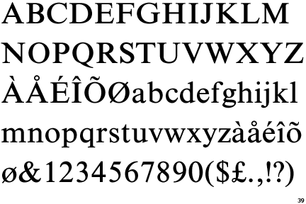
(41,694 posts)Postcrypt
http://www.urbanfonts.com/fonts/PostCrypt.htm
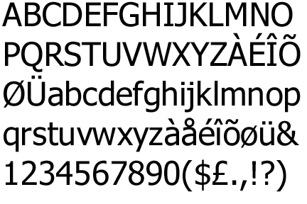
Headhunter
http://www.fontspace.com/david-rakowski/headhunter.
Hey, I just realized this is my 25,000th post.

pokerfan
(27,677 posts)
applegrove
(118,778 posts)pokerfan
(27,677 posts)

Bucky
(54,065 posts)There's no place for it in serious content.
I get the appeal, actually. I'd like to find a font that captures the feel of comic book lettering. The sharp-yet-fat jabs on the capital E, the lack of serifs on all the letters except capital I. It sets a nice cartoony mood, but Comic Sans is too thin and too poorly spaced to not draw attention to itself.
pokerfan
(27,677 posts)For a handwritten style, I like Purisa, an open source font included in Ubuntu.


progressoid
(49,999 posts)Mostly because a lower case "l" is the same as upper case "I".
pokerfan
(27,677 posts)or any readers for that matter. Hurts legibility. To be fair though, Helvetica has that problem as well but I consider Helvetica more of a display font.

Duer 157099
(17,742 posts)Once upon a time I was looking through fonts to try to find one I liked more than the others, and Verdana was it. Although I don't know why. I just liked it for some reason. 

LeftInTX
(25,551 posts)Easy on the eyes.

becca da bakkah
(426 posts)HATE Times New Roman! It makes me cringe every time I see it, and it seems to be the go to choice for most computer-generated documents. UGH! Wish I could completely remove it from my computer.
pokerfan
(27,677 posts)is that it's rather cramped which is great for squeezing text into narrow newspaper columns but not so great when spewed across the entire width of a letter-sized sheet. Not as easy to read as a "book" font but it seems to be the default serif font ever since Windows 95 came along.
http://law.marquette.edu/facultyblog/2009/03/12/why-century-school-book-is-better-for-your-brief-than-times-new-roman/
Bucky
(54,065 posts)
Honeycombe8
(37,648 posts)I end up using those three a lot in documents, spreadsheets, icon text and such in the control panel appearance settings.
This is Times New Roman; it's used in the industry I work in, so I'm used to it. It's very easy to read but slightly smaller than some other fonts, it seems to me:
I like Trebuchet because it's darker than a lot of other fonts, and the fonts for MS seem light to me:

This is Tahoma; it's a default font in MS W7 control panel appearance settings for some things:
Bucky
(54,065 posts)It also has a screwy Pound Sterling sign. If I use Treb, I'll usually go in and switch those characters to Times New, just for the aesthetics of it.
Honeycombe8
(37,648 posts)It's pathetic to be obsessive about little things. But once I've been told, I can't be un-told!
Seriously, though, I'm going to notice that in the documents I do and see what the deal is on those.

kentauros
(29,414 posts)
Okay, I do like it, and even use it often, however, I have never liked the way Centaur does the numeral one. It's too close to a lowercase ell.
Bookman Oldstyle is a very nice font, and will be my choice whenever I get back into writing my book. I find it superior in legibility and just general nice overall look than the idiotic (and seemingly unchangeable) MS default, Times New Roman


RebelOne
(30,947 posts)for magazine copy. The fancier typefaces are best used in headlines and ad copy.

femmocrat
(28,394 posts)It's nice for making signs and posters too.

hunter
(38,326 posts)
harmonicon
(12,008 posts)I used to spend a lot of time choosing an appropriate font, but I realized I was using Arial more than any others, so now I just use it as default, out of pure laziness. It's good enough, and I'm familiar with it. For some things - footnotes, for instance - I'll use Times New Roman.
Agschmid
(28,749 posts)Bucky
(54,065 posts)But I just hate way MicroSoft has foisted Calibri on me in all their damn softwares.
Now everything looks the same. I've had to figure out how to go in and reset the defaults on Word, Excel, and Powerpoint.
Microsoft also hasn't figured out that, with screens getting wider, their programs become annoying when they redesign them to eat up vertical space, but leave me with an excess of horizontal space on the sides of my screen. The human eye scans up and down, not back and forth. Blecch. If it comes from Microsoft, I'm honor-bound to hate it.
pokerfan
(27,677 posts)Really, Microsoft? Everywhere?

quadrature
(2,049 posts)nt
Gorp
(716 posts)Arugula Latte
(50,566 posts)Reallly?
I mean, use the fancy schmany fonts for engraved wedding invitations and the like, but chill out, Uppity Fontists!
Bucky
(54,065 posts)And a bit of the over use (and misuse [font face="comic sans"](see below)[/font]) that makes it so reviled.
I'd like to find a font that captures the feel of comic book lettering. Comic Sans just doesn't quite make it.


Times New Roman - I got too used to it.
Garamond
For the more elaborate ones...
Shelley Volante - I tried to learn how to do this by hand. I don't quite remember the whole thing, so I have a bastardized calligraphy version of it.
Otherwise, I just do Chancery Cursive which is similar to Monotype Corsiva.
Bucky
(54,065 posts)They're both easy on the eyes. Tahoma works like Arial Narrow, squeezing a lot more content into a narrower row of text, but still seems to capture the breezy quality of Verdana. When I'm editing a newsletter, I usually go Verdana for the text and Tahoma for the captions. If I'm needing a serifed font, I'll pair up Bookman Oldstyle with Century Schoolbook.
Verdana
[font face="verdana"]John McCain is an annoying old fart. He needs to quit the Senate and spend his days building dang fences.[/font]
Tahoma
[font face="tahoma"]John McCain is an annoying old fart. He needs to quit the Senate and spend his days building dang fences.[/font]
Bookman Oldstyle
[font face="Bookman Old Style"]John McCain is an annoying old fart. He needs to quit the Senate and spend his days building dang fences.[/font]
Century Schoolbook
[font face="Century Schoolbook"]John McCain is an annoying old fart. He needs to quit the Senate and spend his days building dang fences.[/font]
Paladin
(28,272 posts)
tabbycat31
(6,336 posts)I HATE HATE HATE the Arial and Helvetica type fonts. I've always found them incredibly ugly and change them at the earliest possible convenience.
LanternWaste
(37,748 posts)Some years ago, I forbade the use of Comic in my Dept. (I manage a typesetting and mfg dept) because so many new employees thought Comic was the bee's-knees, and would use it at every opportunity.
For san-serifs typefaces, Lucida Sans Unicode and Futura Medium are my most used-- they're so very clean looking, and the one can use or not use kerning with either and still get a crisp look. For serif style, Bookman and Cheltenham, and for decorative, Impress, Casablanca and Murray Hill.
Anytime I'm laying out a new project with serif fonts, Bookman is my font of choice, as is Lucida for non-serif layouts and proofs.
Down there at the bottom of the barrel with Comic, I'd also list Dom Casual, and pretty much the entire Englishe and Swiss families.

Auggie
(31,186 posts)I own hundreds

Lionel Mandrake
(4,076 posts)[font size="5" face="times"]Times has serifs. I like serifs.
IMO sans serif letters are
[/font][font size="5" face="helvetica"]ugly and hard to read.[/font]
Art_from_Ark
(27,247 posts)but my least favorite is Zapf Dingbats. Is there any use at all for that crazy "font"?

jmowreader
(50,562 posts)The question is, my favorite face for what? I wouldn't set a postcard in the same face as a magazine, or a magazine in the same face as a car wrap.
My favorite sans are Frutiger and Univers...Univers (pronounced univar - the designer was French) is Helvetica with all the fucked-up control points fixed.
I don't have a favorite script, they all have their charms (yes, including Comic Sans which is just the thing if you're designing for kindergarten kids because little kids REALLY like comic sans) but if I do another tattoo with words it'll be in Bergell.
And then there are fonts of abuse: Frutiger 95 Ultra Black and Futura Condensed Extra Bold. If you need to get your point across, one of these will do it.

Paulie
(8,462 posts)Mono space for the win. And OCR for fun.

sakabatou
(42,174 posts)It's the one I use most.

Puzzler
(2,505 posts)
Tommy_Carcetti
(43,198 posts)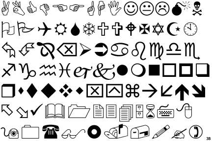
Aw yeah, WingDings!

surrealAmerican
(11,364 posts)... and no, I don't like Arial, its kerning always seems a bit off to me.
Spike89
(1,569 posts)I'm all about readability (writer/editor checking in). To be perfectly honest, I've used the "what is your favorite typeface?" question in hiring interviews and if the designer actually picks and defends a typeface, it is a negative. What is a great font for printing a spreadsheet on a cheap laser or inkjet printer probably isn't the best choice for body copy in a trade paperback book.
Fonts should be chosen to satisfy the purpose of the words. If the primary goal is to grab attention (most headlines) then you can start with attention-grabbing varieties. If you want people to read long passages efficiently and with minimum eyestrain, start with a solid serif font.
If you're doing marketing, advocacy, or other "emotional" publishing, you certainly want to match the message to the "feel" of the font. All the stuff about how Comic Sans can be innappropriate is true, but virtually any font can be misused. If your text is extolling the virtues of classic literature, you probably shouldn't be using futuristic typefaces. If you're praising homespun simplicity, using an elegant font could be a mistake.
I'm not a layout or graphic artist, but I've worked with an awful lot of them in the production of everything from web newsletters to print fliers, daily papers, magazines, and books. The best designers simply use the best font for the circumstances, just like the best landscape artists choose the right color.