Photography
Related: About this forumHere's a "help me choose" thread dedicated to SollyMack
1.
2.
3.
4.
5.
 = new reply since forum marked as read
Highlight:
NoneDon't highlight anything
5 newestHighlight 5 most recent replies
= new reply since forum marked as read
Highlight:
NoneDon't highlight anything
5 newestHighlight 5 most recent replies

Blue_In_AK
(46,436 posts)I can't choose.

Solly Mack
(90,788 posts)2,3,4,1,5 in order of preference.
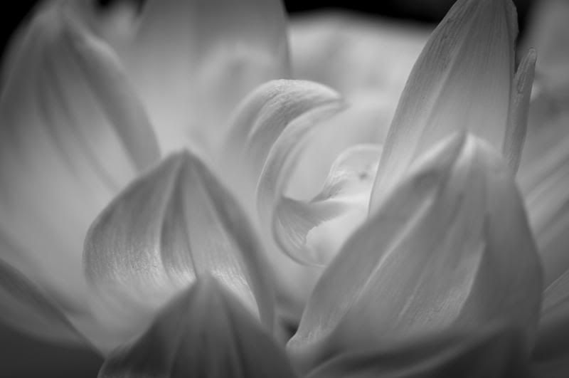
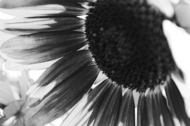
I love 2. I like the composition. I like the tone.
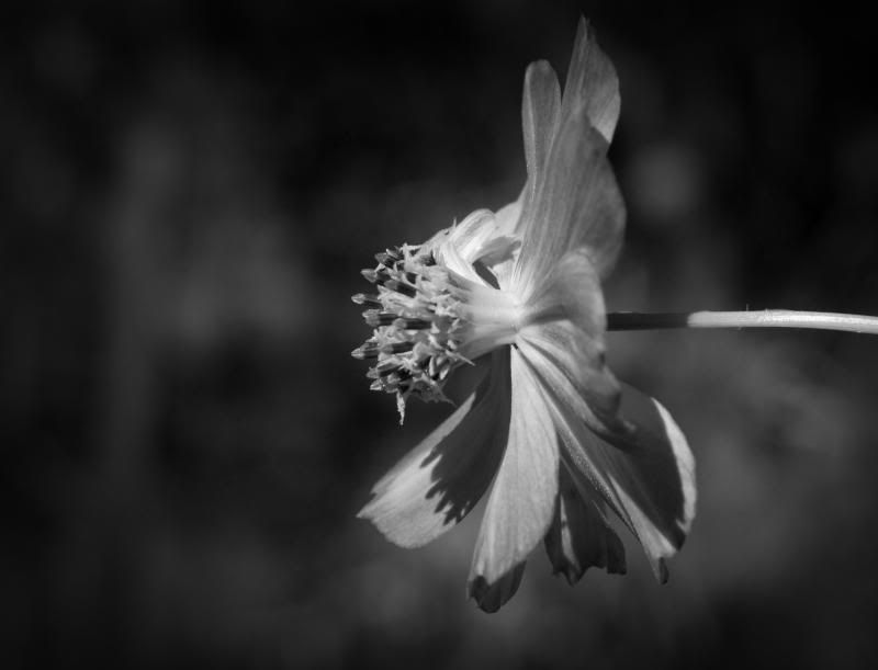
Got a soft spot for 3 though. Love the tonal range.
In 1 I love the exploration of the petals. The imperfections in size and bend. It's a delicate photo. Makes you want to touch it.
Still - 2 for overall composition.

NV Whino
(20,886 posts)But I like 1 for the delicacy, and 3 keeps drawing me back for the tonal values. Pretty much what you said.
But, at noon I'm heading over to a friend's to shoot some orchids and stuff. May I can get one that combines all that and blows these out of the water.
Solly Mack
(90,788 posts)I bet you can get a killer shot.
I'm a fan of B&W. Just not my B&W.
Course, you know, you risk expanding your choices. 

ManiacJoe
(10,136 posts)I keep thinking maybe more contrast but maybe not....

Callalily
(14,896 posts)Glad to lend my help! 
mnhtnbb
(31,407 posts)It's really hard to decide whether to do a landscape, a single flower, or an arrangement.
I think I like your #3 the best.
Solly Mack
(90,788 posts)I'm leaning toward not using them since they are older and I have new ones.
1.

2.

3.

4.

ManiacJoe
(10,136 posts)Great use of negative space. Nice lighting, too.
Solly Mack
(90,788 posts)Going with something new though. Not even as good, just something I like.
Solly Mack
(90,788 posts)I'm still leaning toward the new stuff.
Not as good as some but there is one I like.

alfredo
(60,077 posts)Solly Mack
(90,788 posts)lol
alfredo
(60,077 posts)Like, and it wins.
Solly Mack
(90,788 posts)alfredo
(60,077 posts)Solly Mack
(90,788 posts)and not necessarily the best one.
alfredo
(60,077 posts)Solly Mack
(90,788 posts)alfredo
(60,077 posts)NV Whino
(20,886 posts)3 has almost a metallic look to it. Love it.
Solly Mack
(90,788 posts)Sometimes I get my husband to choose my entry. I get so annoyed with myself and I tell him to "Just pick one!". (he always replies, "I'm not falling for that again"
If I were to go with pretty I'd go with 4. I think I'm going to be stubborn and go with something else. lol

Mira
(22,380 posts)three and four knock the others out of the park
Solly Mack
(90,788 posts)I think it needs a better crop.
Mira
(22,380 posts)I liked it a lot. Then it started losing me. I have a problem with the dead center aspect. Sometimes it works great, but to me, here it does not. Then i got out my paper pieces (white pieces of paper held to the screen to play with crop before I go to the trouble of cropping for real) and realized I liked it when the handle of the piece of crockery was the center, not easy to do and preserve all the rest but not impossible.
My original liking it has to do with the incongruity of the light weight flowers and the heavy weight of the pot.
I love that aspect, and I think it could be preserved with a different crop and less of the background in general.
I am honored you asked my opinion.
Solly Mack
(90,788 posts)I respect your opinion.
I've got a few with the handle at center. I'll go over those again.
Here's a crop I just did - something along the lines of this?

Mira
(22,380 posts)Yet loses the dead center arrangement.
And it may be better than what I had in mind which had more background to the right. You get the feel I was after. I really like this basic idea, once I did a screen print illustrating this concept with a heavy vase and light airy twigs.
I'll look in the morning to see if I can put my finger on it and shoot you a photo.
Solly Mack
(90,788 posts)ManiacJoe
(10,136 posts)my entry may need a bit more work....

Solly Mack
(90,788 posts)
Dwinal87
(126 posts)#5. The back lighting gives it a certain something for me, but you couldn't go wrong with any of them!
NV Whino
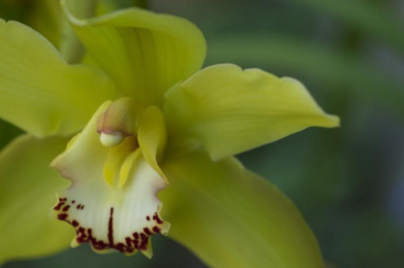
(20,886 posts)I'm posting the color version, too, because I actually like the color better and because it's interesting to see the conversion.
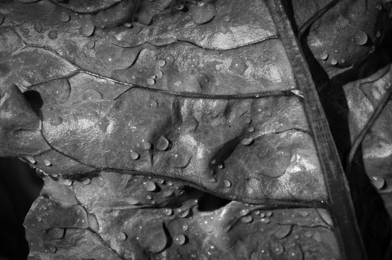
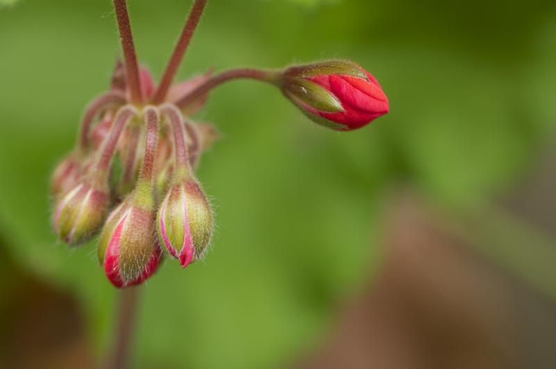
Orchid B&W
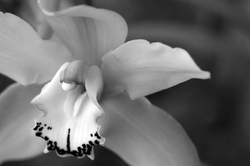
Orchid color
Chard B&W
Chard color
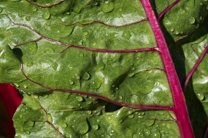
And just for the heck of it, here's #3 in color. I think the B&W version of this is equally appealing.
Solly Mack
(90,788 posts)I like the chard but I like it better in color.
I wish the Orchid was centered more. I do like the tone of it. It's a pretty photo.
Another one I was considering

alfredo
(60,077 posts)mnhtnbb
(31,407 posts)I LOVE the #3 in color--and it was my favorite in B&W.
I've been playing around with some archive photos--but the moon drew me out on the deck--and then I looked at our
dogwood in full bloom. Took a bunch of photos--then went out at dusk took one shot--and now I think THAT's the one!
LOL!  Having a really tough time choosing...but having a lot of fun!
archived camellias shot I composed almost 4 years ago
[URL= .html][IMG]
 [/IMG][/URL]
converted to B&W
[URL= .html][IMG]
 [/IMG][/URL]
And walking the neighborhood about 10 days ago
[URL= .html][IMG]
 [/IMG][/URL]
converted to B&W
[URL= .html][IMG]
 [/IMG][/URL]
alfredo
(60,077 posts)play around with the color balance (a very light touch of yellow). Adjusting the curves is an alternative to contrast. Adjusting the levels will do wonders.
How did you convert to B&W?
Mira
(22,380 posts)the color versions and the b/w are tremendously interesting - even though side by side - their emotional impact is so different. Lovely for the color, but dramatic for the b/w.
The third in color is gorgeous. In this version I don't think a crop would improve it.
alfredo
(60,077 posts)Mira
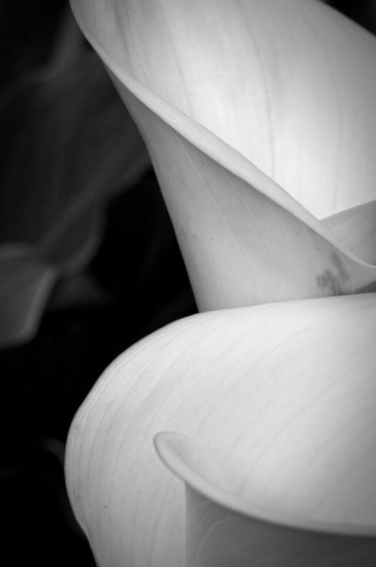
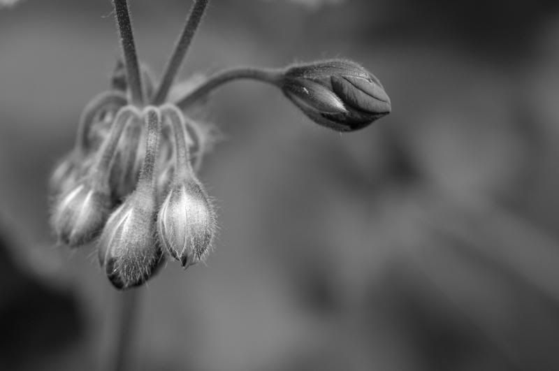
(22,380 posts)The first one strikes a happy chord with its sensitive and airy layers. I think I like it best. Second is number 3. I really like the trio of buds and their light difference to the solo one. May I suggest cropping to splitting half of the neg space on the bottom away, and one third of it on the right? third like is the calla lily. The bottom two are a bit too harsh for my taste today.
Can't say about tomorrow...
applegrove
(118,817 posts)
ljm2002
(10,751 posts)...but it has to be #2 IMO, because: (1) the strong contrast of the black background with the white flowers, (2) the detail in the flowers, and most of all (3) the composition which is so wonderfully artistic.