Environment & Energy
Related: About this forum50 Years of World Growth

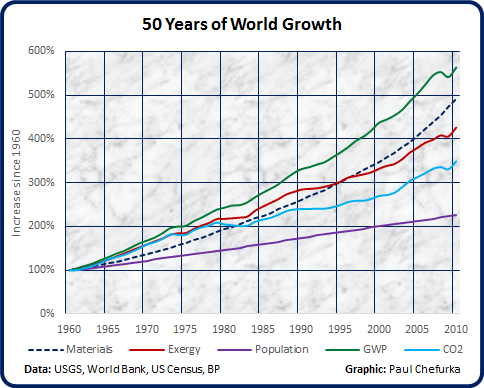
This graph compares the growth of civilization over the last 50 years using five different measures: the mass of materials used, useful energy (exergy) consumed, CO2 emissions, GWP in constant dollars, and population. They have been normalized so that the value in 1960 is 1, in order to allow the different growth rates to be compared.
Population growth is currently linear (~77 million new people per year), while all the other measures are exponential.
 = new reply since forum marked as read
Highlight:
NoneDon't highlight anything
5 newestHighlight 5 most recent replies
= new reply since forum marked as read
Highlight:
NoneDon't highlight anything
5 newestHighlight 5 most recent replies
NYC_SKP
(68,644 posts)Ghost Dog
(16,881 posts)in 1960; subtract 100% from all data points.
GeorgeGist
(25,321 posts)GliderGuider
(21,088 posts)Your technique graphs the increase since the origin, the one I chose graphs the size relative to the origin. An increase of 100% results in a relative size of 200%. No big deal, so long as the technique is described so that the audience can understand it.
The biggest issue for accuracy is establishing the absolute value of the origin. If that is incorrect, all the subsequent values will be off. In the case of all the values but one, finding this starting value straightforward, based on published data. The exception is the amount of material incorporated into civilization, for which I have data going back only to 1900. A change to this value dramatically alters the later series.
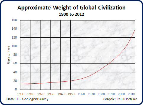
This morning I figured out a more reliable technique for making that estimate. I realized I could calculate how much material was being added for every new person added to the human hive for every year since 1900, and use that trend to assign an appropriate amount to each person alive in 1900. It turns out that from 1900 until 1960, the addition of each new person resulted in an average addition of 8 tonnes of new structural material. The value has risen drastically since 1960, until over the last decade the value has risen to averaged about 50 T/person.
This new estimate raises the 1900 material mass from my initial rectal pluck of 1 GT to a more realistic 13 GT. As a result, the overall graph changes, and the increase in mass from 1900 to 2010 drops from a factor of 125 (a nice doomy number) to 10.5 (not so doomy but far more plausible):
The 50 year graph now looks more plausible as well:
Such are the risks of premature publication. 
Ghost Dog
(16,881 posts)Thanks, Paul. (Even more reason to go out, make music, get laid again and again, enjoy the end of the world, whatever)...

muriel_volestrangler
(101,316 posts)GliderGuider
(21,088 posts)Never mind the idea, focus on the words. That's always a good strategy.