Democratic Underground Latest Greatest Lobby Journals Search Options Help Login
Google

November Roundtable

Printer-friendly format Printer-friendly format
Printer-friendly format Email this thread to a friend
Printer-friendly format Bookmark this thread
This topic is archived.
Home » Discuss » DU Groups » Arts & Entertainment » Photography Group Donate to DU
 
F.Gordon Donating Member (1000+ posts) Send PM | Profile | Ignore Sat Nov-25-06 03:33 AM
Original message
November Roundtable
Since I've now pissed off about 90% of the photogroup and 91% of DU with my Cat Comments I decided that now would be a good time for a diversion.
:yoiks:

What is a Roundtable? Well, here are some guidelines that have been established by JeffR..

Suggested guidelines:

First poster posts a pic. Provides as much technical info as desired. Gives some background about where and when pic was taken. The photographer then essentially offers a self-critique, explains why he/she thinks the pic is successful or unsuccessful, why the subject appealed (sentimental reasons, aesthetic attraction, interesting event or scene).

Responses follow. First detailed critique/analysis posted (can be critical, but should be constructive) earns the poster a chance to post their pic, and the process continues. Anyone is welcome to make further comments on a pic above (or comments on other comments), but only the first poster gets to post the next pic.

Roundtable ends at 10 pics, though further comments are still welcome.

No theme and no voting involved in roundtables; just post pics you're especially pleased with, or frustrated about.


And there is also this...

Caveats (based in part on comments by regnaD kciN):

People may have their feelings hurt, if they're especially fond of the pic they're posting. Everyone should be forewarned to check their ego at the door when posting a pic. The idea is to get feedback from good photographers, be they professional or amateur. Don't post a pic if you don't want a critique.

Conversely, people may temper their criticism out of an abundance of consideration. Understand that by posting a pic in these threads, the poster is explicitly asking for opinions. Try to be candid.

Opinions are opinions, and taste is taste. When commenting, please take pains to specify why you feel as you do. Be as specific and concrete as you can. And be as detailed as you can. Please don't post a perfunctory comment just for the sake of getting to post the next pic in the thread. Non-competitive is the keyword here, and if we can make this work, there's plenty of opportunity for everyone to get a shot (pun intended).

Understanding that people's monitors are not calibrated uniformly, please restrict commenting overmuch about relative brightness and contrast issues, unless it seems apparent that the pic is radically washed out or obviously too dark.


Sooo... if any of that made any sense I've decided to attempt to bring the Roundtable discussion idea back from the dead.

===============================================================================================
Technical Mumbo-Jumbo: ISO-400 : f/5.6 : Exposure 1/640 sec : Focal 35mm : Took this snap today

How the snap came to be: Walkin' along... saw the statue thing and thought (yawn) boring. Walked past the statue and turned back and saw the old bench. Looked at the statue.. looked at the bench.. the statue.. the bench....
:think:

Got loooow behind the statue and intentionally underexposed the snap by cranking up the ISO so I'd get a faster shutter speed. This was the result. I did very little in the spin cycle of the Rawomatic 3000 and just did a simple fotochop b&w conversion.


This is a snap I sorta' kinda' like. There are a few things I don't like about it and would be curious if others "see" these same things I do. I think the out-of-focus old bench against the tree adds a little mystery to the benign statue object. They are connected... yet they are not connected.

That's it. Now is your chance to get back at me for all my Cat Comments... :D
Printer Friendly | Permalink |  | Top
RagingInMiami Donating Member (1000+ posts) Send PM | Profile | Ignore Sat Nov-25-06 12:33 PM
Response to Original message
1. OK, I'll play, since I'm in the minority that you didn't piss off
Edited on Sat Nov-25-06 12:39 PM by RagingInMiami
I like how you made that photo black and white.The only thing I can tell you is I would like to see it look more human-like and less statue-like (like dude). The book and the reflections off the statue is what gives it away.

Did you expose for the statue or for the sky? From my experience, if you expose for the sky, then focus on the statue, you will get less reflection. And if there are clouds in the sky, you will be able to get that as well instead of washing it out. I'm not sure if there were any clouds on this day.

Here is my photo. I took this the other day as I was pulling out of Star Island on Miami Beach, a very ritzy neighborhood that most people believe is closed off the public because you have to go through a guard shack to enter it. But because it's streets are tax-funded, it is open to the public. I was driving my girlfriend through Star Island to show her the mansions (where Shaquille O'Neil and Gloria Estefan live) because she had been lead to believe that it was unaccessible to common people.

Anyway, as we were leaving to get back on the causeway that connects the city of Miami to Miami Beach (which is a separate island), I saw this ship and I couldn't resist stopping and pulling over to the side of the bridge. I was standing in the middle of the bridge snapping away as someone behind me pulled up in a late model Mercedes, blowing the horn and yelling at me for to get out of the road.

I turned to make sure it wasn't Shaq, then I blew him off. After all, these are my streets too.


Shutter speed: 1/50 sec
Aperture: 3.5
Exposure mode: Program
Flash: Off
Metering mode: Multi-segment
ISO: 400
Lens: 24 to 70mm
Focal length: 24mm
Printer Friendly | Permalink |  | Top
 
JeffR Donating Member (1000+ posts) Send PM | Profile | Ignore Sat Nov-25-06 06:57 PM
Response to Reply #1
2. Magic City! I stared at this for a long time
I have a Miami bias, of course, but even if I didn't this would really evoke the magical dimension of Miami, the dimension other than that of the ugliness the light of day can unveil.

This is just a surreal, beautiful photo. The purple sky, the strings of lights, "the expensive delicate ship" looking like a roadblock. It's a pure image; the cruiseline would do well to advertise itself with this than with the usual retina-bleaching shots of ships in the high noon sun.

This photo is a glimpse of unreal reality. Captured just right at just the right moment.

I have a pic, but I'll post it separately.

Printer Friendly | Permalink |  | Top
 
JeffR Donating Member (1000+ posts) Send PM | Profile | Ignore Sat Nov-25-06 07:04 PM
Response to Reply #2
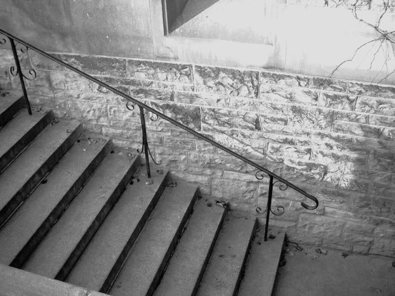
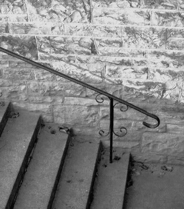
3. Hart House, November 24
This was shot with my 5-megapixel point'n'shoot. I can't read the EXIF off the "original" for want of a program I haven't gotten around to reinstalling. This was shutter-priority, I think, but can't remember for sure. Had to do a lot of messing with curves after desaturating it, maybe too much? Considered cropping this several different ways, then decided to leave it as is.


Printer Friendly | Permalink |  | Top
 
Ms. Toad Donating Member (1000+ posts) Send PM | Profile | Ignore Sat Nov-25-06 08:15 PM
Response to Reply #3
7. I like the texture and almost metallic quality of the bricks
but I find myself struggling to find a specific focus in the picture. Perhaps cropping a vertical shot including just the bottom 3-4 steps, landing pad bricks above it? That might make the post and end curl on the railing a focal point, with the bricks above and the steps below creating additional interest.
Printer Friendly | Permalink |  | Top
 
JeffR Donating Member (1000+ posts) Send PM | Profile | Ignore Sun Nov-26-06 12:28 PM
Response to Reply #7
14. Thanks, Ms. Toad
Rotated the pic & tried a crop per your suggestion. This will never be mistaken for a good photo, but it is a lot more interesting pared down this way.


Printer Friendly | Permalink |  | Top
 
Ms. Toad Donating Member (1000+ posts) Send PM | Profile | Ignore Sat Nov-25-06 07:40 PM
Response to Reply #1
6. Love the color
I'd go for quite a different perspective. Since it wasn't Shaq in that Mercedes, drive back to the peak of the bridge or jump on the roof of your car so the ship is higher above the horizon.
Printer Friendly | Permalink |  | Top
 
JeffR Donating Member (1000+ posts) Send PM | Profile | Ignore Sat Nov-25-06 07:13 PM
Response to Original message
4. Nice to see another Roundtable. Here's to you, Mr. F.
The statueness of the statue is a virtue, I think. The only crappy suggestion I have is to crop out everything to the right of where the statue's head meets its neck. It might accentuate the tension between the light area in the middle and the areas of shadow that frame it. Or I might be entirely wrong, as happens with some frequency.

Printer Friendly | Permalink |  | Top
 
Ms. Toad Donating Member (1000+ posts) Send PM | Profile | Ignore Sat Nov-25-06 07:33 PM
Response to Original message
5. I like the composition, generally,
but I find the busy-ness of the background and the overgrown clump of branches on the left trunk distracting. The busy background might be calmed by shifting to the right for the shot - although you might lose the inscription in the book (can't quite make it out, but I bet I could enlarge it and read it). I might try to sharpen the focus on the bench to make it contrast more with the busy background (or to soften the focus even more on the background).

Even though I'm a cat person your comments don't bother me. Aside from anything else, I had to compete with Hobbs in the first round - and he's not even REALLY a silhouette :)
Printer Friendly | Permalink |  | Top
 
F.Gordon Donating Member (1000+ posts) Send PM | Profile | Ignore Sun Nov-26-06 01:53 PM
Response to Reply #5
15. Not sure which post to reply to (this is a multiple reply)
RagingInMiami

I like how you made that photo black and white. The only thing I can tell you is I would like to see it look more human-like and less statue-like (like dude). The book and the reflections off the statue is what gives it away.

Did you expose for the statue or for the sky? From my experience, if you expose for the sky, then focus on the statue, you will get less reflection. And if there are clouds in the sky, you will be able to get that as well instead of washing it out. I'm not sure if there were any clouds on this day.


Reply: I didn't want to hide the fact that it was a statue. I've played with attempts at turning it into a fotochopped silhouette type thing and I don't like the look of it. Yes, everything was locked on the statue. It was actually a mostly-sunny day and I was snappin' into the sun. Not much to lock onto in the background and I really didn't want the background to dominate the snap.

JeffR

The statueness of the statue is a virtue, I think. The only crappy suggestion I have is to crop out everything to the right of where the statue's head meets its neck. It might accentuate the tension between the light area in the middle and the areas of shadow that frame it. Or I might be entirely wrong, as happens with some frequency.


Reply: You've touched on what I don't like about the snap. The background. This wasn't a "landscape" type snap and I didn't want everything in focus and everything exposed. As a "viewer", like yourself, it makes one uncomfortable looking at the head with the annoying background. I thought it'd be blown to bits enough to reduce it (always check your background kids!!!), but it wasn't.

Ms. Toad

I find the busy-ness of the background and the overgrown clump of branches on the left trunk distracting. The busy background might be calmed by shifting to the right for the shot - although you might lose the inscription in the book (can't quite make it out, but I bet I could enlarge it and read it). I might try to sharpen the focus on the bench to make it contrast more with the busy background (or to soften the focus even more on the background).


Reply: You and JeffR both "saw" what I was annoyed with. Ragin' "saw" it too... and offered one solution to fixing it. Ideally I should dodge/lighten the background and reduce it so it's very very faint. Your suggestion on snappin' this differently is a good one. I actually started from the right and moved to the left. The problem was the background.. it got even busier... and I lost the shadow from the tree which I was trying to keep. I can fotochop the tree/bench and make it sharper... will give that a try. My intention when I snapped it was to focus all the "interest" on the statue with the tree/bench as a secondary thing. :crazy:

My comments. I'm a horrible teacher but I wanted to show something with my snap....


Ideally you want to keep your subject matter in thirds. It's not a hard-fast rule but it will help make you a better photog. The theory is that people are more comfortable when looking at photos where everything is lined up and focused on the 3rds. When you look through your viewfinder or at your LCD screen.. try to draw an imaginary tic-tac-toe grid.

See the "chaos" in the upper left hand grid? That's what Ms. Toad is talking about. It's distracting. See the head with the distracting background? That's what Jeff R is talking about. If I had gotten a little lower and moved slightly more to the right I could have put the head above the distracting background.

Thanks for commenting everyone!!!
:hi:
Printer Friendly | Permalink |  | Top
 
blueraven95 Donating Member (1000+ posts) Send PM | Profile | Ignore Wed Nov-29-06 06:48 PM
Response to Reply #15
42. actually - this is the first thing they taught us at film school
First day, first class. People automatically look at the at the "third" (there's a technical term that I can't remember) first, so when framing, its best to put the subject in one of the "thirded" spots. It works on almost every good photograph.


Wish I could come up with the right terminology - I'm not sure if this post makes sense.
Printer Friendly | Permalink |  | Top
 
Ms. Toad Donating Member (1000+ posts) Send PM | Profile | Ignore Sat Nov-25-06 08:25 PM
Response to Original message
8. Photo #4
Five of Twelve


f 2.8
ISO 200
Exposure time 10/300
super Macro (built in)
focal length 6.8mm
flash deliberately suppressed

I've saturated the color a bit, and cropped it, but it is otherwise unedited. I like the detail and juiciness of the pie surface and the color. Not terribly happy with the upper left background. I've tried various ways of softening it and darkening it, but the boundary between the last pie and the light area never looks right (short of blurring out the last {center back} pie pan and crust).


Printer Friendly | Permalink |  | Top
 
blueraven95 Donating Member (1000+ posts) Send PM | Profile | Ignore Sat Nov-25-06 09:15 PM
Response to Reply #8
9. I just finished a huge piece of pumpkin pie, and now looking at your photo...
I want more!


The colors are wonderful - definitely invoking November, and I love glistening quality of the pie filling. I agree with you that there is something wrong with the upper left corner. The perspective feels off. Something about it makes me feel like the pie in the foreground is on an angle and is about to fall to the floor. I would suggest cropping the picture down, but I think you would lose too much of the photo. On the other hand, the light color of the background on the right really contrast the pies and help balance everything out.

If I am presuming properly that your title refers to the 5 pies in the photo, then you are a very ambitious baker :9
Printer Friendly | Permalink |  | Top
 
Ms. Toad Donating Member (1000+ posts) Send PM | Profile | Ignore Sat Nov-25-06 09:30 PM
Response to Reply #9
10. Yep 5= 5 visible
Edited on Sat Nov-25-06 09:32 PM by Ms. Toad
out of 12 baked.

Seven of the pies are on the ironing board cooling (only 5 in the camera's view, with the last 4 in the oven), and the back lighting from the front window helped the top glisten, but its really too bright.

Edited to add: I think I could crop it partway up the front pie and improve it. I just scrolled part of the picture out of view and I like how it looks - thanks.
Printer Friendly | Permalink |  | Top
 
xiamiam Donating Member (1000+ posts) Send PM | Profile | Ignore Sat Nov-25-06 09:42 PM
Response to Reply #8
12. didnt have any pumpkin pie this year...i could almost taste it when your photo came up...ummmm..
i wouldnt change anything...except i thought that it looked a wee bit over sharpened on top of the pie..saturation in picasa (sometimes) produces an almost unnatural effect similar to sharpening too much...the photo also invoked a mental image of the cooks in that kitchen...i like it...really makes my mouth water and i havent a sweet munchie to satifsy the urge your photo initiated...thanks a lot!!!!
Printer Friendly | Permalink |  | Top
 
Ms. Toad Donating Member (1000+ posts) Send PM | Profile | Ignore Sat Nov-25-06 10:09 PM
Response to Reply #12
13. You're welcome :)
All saturation does in PSP is to make the color more intense - the "sharpening" is just the angle of the light from the window/angle of the camera (I pulled up the original to check).
Printer Friendly | Permalink |  | Top
 
JeffR Donating Member (1000+ posts) Send PM | Profile | Ignore Mon Nov-27-06 09:17 AM
Response to Reply #12
21. xiamiam, according to the rules, such as they are, you're next!
What ya got?

Printer Friendly | Permalink |  | Top
 
JeffR Donating Member (1000+ posts) Send PM | Profile | Ignore Sun Nov-26-06 06:05 PM
Response to Reply #8
16. Whatever your dissatisfaction with aspects of the photo
the subject matter is so enticing, it's above critique. Mmm mmm mmm, looking good.

Printer Friendly | Permalink |  | Top
 
CC Donating Member (1000+ posts) Send PM | Profile | Ignore Wed Nov-29-06 05:53 PM
Response to Reply #8
39. What cruelty is this?
I have no kitchen yet and no where to cook so no pumpkin pie. If they tasted as good as the pic looks I would of been in heaven.


Printer Friendly | Permalink |  | Top
 
BrightKnight Donating Member (1000+ posts) Send PM | Profile | Ignore Thu Nov-30-06 12:06 AM
Response to Reply #8
44. alive
That image is alive. I can smell, taste and feel it. I am one wisp of steam away from drooling.

It is a poetic and dramatic slice of life moment. We can all fill in the narrative.

I like the contrast between the soft natural light on the pressed crust and the hard glistening reflections on the wet pie surface.

There are two things that could be better.

The image would have been better without the shallow depth of field. The blurry foreground and background focuses attention on the pie surface and the photographer but a sharp image would make it even more alive. (If you don't already know this f 2.8 is very large and has a shallow depth of field. Stops on the small end of the scale (f 11 or f 22) have a larger depth of field.)

I like a lot of things about the image but the composition is not quite right. You might be able to help it with cropping. I often shoot a subject several different ways. This gives me options when I print and I sometimes get better ideas when I rethink the shot.
Printer Friendly | Permalink |  | Top
 
blueraven95 Donating Member (1000+ posts) Send PM | Profile | Ignore Sat Nov-25-06 09:33 PM
Response to Original message
11. Photo #5
Edited on Sat Nov-25-06 09:44 PM by blueraven95
This is from last night.

Ariana


I am not digital camera savvy enough to give you the technical details that I really should have been keeping track of anyway. :blush: I'm playing with my sister's camera and she has convienently lost the manual so I'm winging it.

I am fond of this photograph for sentimental reasons - Ariana a)hates having her picture taken b)has been having "issues" (mostly the fact that she is 14) so she refuses to smile, let alone laugh unless we catch her off guard and c)fought like the devil about wearing the headpiece. So to get a, b, and c in one shot is a victory in my opinion. This photo is completely untouched with the exception of resizing for the web. The wrinkles in the background at the base of her neck are driving me nuts.
Printer Friendly | Permalink |  | Top
 
JeffR Donating Member (1000+ posts) Send PM | Profile | Ignore Sun Nov-26-06 06:08 PM
Response to Reply #11
17. The background wrinkles demand to be cloned out
It's a nice candid. Other than the wrinkles, it doesn't need any more digital TLC.

Printer Friendly | Permalink |  | Top
 
blueraven95 Donating Member (1000+ posts) Send PM | Profile | Ignore Sun Nov-26-06 09:25 PM
Response to Reply #17
18. thanks, I was beginning to think that I had posted a conversation ender
I haven't had the time to play with it - but I will. I think my photoshop skills are rusty - its been awhile since I've really retouched photos, and that was with an earlier version. Everything feels so different.
Printer Friendly | Permalink |  | Top
 
Ms. Toad Donating Member (1000+ posts) Send PM | Profile | Ignore Sun Nov-26-06 10:47 PM
Response to Reply #17
19. Didn't want to be the first, since I already posted a photo
Ditto the first response on the wrinkles - its an easy fix. Clone, scratch remover, or a more recent favor Gaussian blur.

Another challenge is the flash shadow - I always try to take pictures without a flash to avoid it. I've gotten so I can take pictures in a dark auditorium without a separate tripod by using my body (sometimes with a wall) as a tripod. (Ratio of good to bad pictures is better, though, with a standalone tripod :) )
Printer Friendly | Permalink |  | Top
 
CC Donating Member (1000+ posts) Send PM | Profile | Ignore Wed Nov-29-06 06:01 PM
Response to Reply #11
40. Great pic and save it
so you can remember she does smile, until she gets past this stage and starts smiling again.

No extra to add except, with flash if you can get it up higher and bring the model away from the background you can lose the flash shadow. If you have a separate flash a bracket or even cord will help lift it higher. If it is on camera stand on a step stool of something like that, though it will change the angle of the photo. Pulling her away from the background would of helped blur the wrinkles too. Still a great photo and love the expression on Ariana's face.


Printer Friendly | Permalink |  | Top
 
blueraven95 Donating Member (1000+ posts) Send PM | Profile | Ignore Wed Nov-29-06 06:42 PM
Response to Reply #40
41. thanks, those were some great suggestions.
we were in a really small space so there just wasn't a lot of room to really work. What I wouldn't give to have space to set up a studio....

I have to admit, I haven't played with flash as much as I should - I really come from a film (as in movies) world, and I feel like I know very little about the technical side of photography...I want to think that they are the same, but they really aren't.
Printer Friendly | Permalink |  | Top
 
Eurobabe Donating Member (1000+ posts) Send PM | Profile | Ignore Mon Nov-27-06 02:11 AM
Response to Original message
20. Oh, dang, I missed the fur flying!! n/t
Printer Friendly | Permalink |  | Top
 
intheflow Donating Member (1000+ posts) Send PM | Profile | Ignore Mon Nov-27-06 10:16 PM
Response to Original message
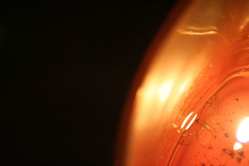
22. Caught Moth
Edited on Mon Nov-27-06 10:17 PM by intheflow


This is how most of my candles meet their end, in a smothering of flying things whose curiosity about fire got the best of them. However, most of the bugs end up kind of fried. This one alighted in wax and seemingly just resolved to let it encase it; no sign of struggle. The fire gave it an appealing irridescence, imo. In fact, my alterntive title for this shot is "Jeweled Moth."

But really, this photo only caught a flavor of what appealed to me. Part of it is that it was hard to get a good meter reading because of the bright flame and the darkness around the candle. I tried putting on lights to even the metering, but the moth lost its irridescence and became flat and washed out.

So now I can't tell if this shot appeals to me because its color and subject catch a trace of what initially appealed to me, or if it's just a dumb shot. What do you all think?
:shrug:
Printer Friendly | Permalink |  | Top
 
JeffR Donating Member (1000+ posts) Send PM | Profile | Ignore Tue Nov-28-06 09:39 AM
Response to Reply #22
23. This is a really beautiful image
the colors are really seductive, and having the subject matter so far off-center really adds to the eyecatching (mothcatching?) quality. The only thing that's unfortunate is the blobs of light at the bottom right. They distract a little too much from the moth and the other highlights.

Printer Friendly | Permalink |  | Top
 
intheflow Donating Member (1000+ posts) Send PM | Profile | Ignore Tue Nov-28-06 11:50 AM
Response to Reply #23
26. Those blobs are the candle flame.
Edited on Tue Nov-28-06 11:51 AM by intheflow
If I adjusted the light meter, the flame came into focus and the moth all but disappeared.


I couldn't just meter on the moth because it was a hand-held shot and I just couldn't hold the camera steady enough to get a clean shot. Cropping's not really an option because of how close the moth is to the flame. So I guess this photo just is what it is.
:shrug:
Printer Friendly | Permalink |  | Top
 
insane_cratic_gal Donating Member (1000+ posts) Send PM | Profile | Ignore Tue Nov-28-06 11:01 AM
Response to Reply #22
25. Is this Amber? Or a Candle?
I do love the shot and I think the dead space tends to lend to the drama of the picture vs taking away from it. I agree with Jeffr though the light beneath the month (assuming is candle light) is slightly distracting because it's the reflection of the candle light reflected back into the lens projected back into the reflection?

I think lol.. but I really do like the shot very dramatic
Printer Friendly | Permalink |  | Top
 
intheflow Donating Member (1000+ posts) Send PM | Profile | Ignore Tue Nov-28-06 11:55 AM
Response to Reply #25
27. It's a candle.
The blob is the burning wick. I'm glad you liked the shot! :hi:
Printer Friendly | Permalink |  | Top
 
insane_cratic_gal Donating Member (1000+ posts) Send PM | Profile | Ignore Tue Nov-28-06 10:53 AM
Response to Original message
24. Photo 7
Edited on Tue Nov-28-06 11:02 AM by insane_cratic_gal
Nikon D100
50 mm lens
Exposure 1/40 sec
F stop 1.8
natural light

I almost had it! at smidge to the left and it could of been a perfect shot or at least a perfect frame..


Btw I screwed up the rules! sorry.. It's been awhile since we have done this.. =/
Printer Friendly | Permalink |  | Top
 
intheflow Donating Member (1000+ posts) Send PM | Profile | Ignore Tue Nov-28-06 12:00 PM
Response to Reply #24
28. You screwed up what rules?
I love this shot, even with the cut off nose. If it had been a shot of a statue, it would have been bad. As it is, it looks like the big dog moved its head just as you clcked the shutter. The important part of this photo, for me, is the look on the big dog's face: "Do you see what the little dog is doing to me?" lol! I also love the background coloring. The black backdrop behind the little dog is especially dramatic.
Printer Friendly | Permalink |  | Top
 
insane_cratic_gal Donating Member (1000+ posts) Send PM | Profile | Ignore Tue Nov-28-06 04:43 PM
Response to Reply #28
29. your not suppose to post unless
Your the first one to reply to the last picture, you then have to post a picture. I didn't respond to one first, hence me messing up the rules.

the backdrop is actually the stairs. It's natural light coming in from the doorway (they're in the foyer) Maroon carpet with two white dogs! It's official I think I am insane =/
Printer Friendly | Permalink |  | Top
 
intheflow Donating Member (1000+ posts) Send PM | Profile | Ignore Tue Nov-28-06 05:55 PM
Response to Reply #29
31. I guess I missed that part.
Yikes, all these rules all over the place. My right brain is offended--what about art for art's sake?


Printer Friendly | Permalink |  | Top
 
JeffR Donating Member (1000+ posts) Send PM | Profile | Ignore Tue Nov-28-06 05:28 PM
Response to Reply #24
30. xiamiam was up next, but hasn't posted anything
so wot the heck?

Love your dogs. We have a similar colored carpet; it has to be scraped with a steel brush - no vacuum ever invented can keep up with the dog hair spring and fall.

This is a really pretty portrait, despite that one missing nose. Just tell people that's how you wanted the dog to pose... The lighting is perfect and I love the black background with just a small patch of the carpet color showing. Good work.

Printer Friendly | Permalink |  | Top
 
RagingInMiami Donating Member (1000+ posts) Send PM | Profile | Ignore Tue Nov-28-06 06:48 PM
Response to Original message
32. Now that anarchy has overtaken the November Round Table Thread
Let me continue with the rule-breaking and post a photo I took last night. This, ladies and gentlemen, is a perfect example of why I love my Canon 5D. I took this handheld at 1600 ISO and I did not need to do any noise reduction processing to it, as I would have had to do with my 10D. All I did was the normal Photoshop processing that I do with all my photos.

This was taken underneath the MacCarthur Causeway, which connects the City of Miami to Miami Beach. The building to your right in the background with the blue lettering is the Miami Herald main office, which last week made national news when a disgruntled cartoonist walked in with a plastic machine gun.


1/10 sec
Aperture: 2.8
Exposure mode: Program
Exposure compensation: -1
Flash: Off
Metering mode: Multi-segment
ISO: 1600
Lens: 24 to 70mm
Focal length: 42mm
Image size: 2250 x 1500
Printer Friendly | Permalink |  | Top
 
blueraven95 Donating Member (1000+ posts) Send PM | Profile | Ignore Tue Nov-28-06 08:48 PM
Response to Reply #32
33. wow. just wow.
I love it. I think it might be time to rethink Miami as a destination spot - I've always figured it's too hot, but if it looks like that...I could maybe ignore the heat.

(I wish that little bit of blue light in the right-hand side of the picture was not there. I'm finding it distracting.)


I'm not really critiquing, so I will not be posting the next pic. Someone else's turn.

Printer Friendly | Permalink |  | Top
 
F.Gordon Donating Member (1000+ posts) Send PM | Profile | Ignore Tue Nov-28-06 10:50 PM
Response to Reply #32
34. No fancy dancy cameras allowed
:silly:

I like this much more than your original photo up thread. All kinds of things I like about it. Too many to list.

If I was forced to come up with negs... it's too busy. Too much going on. As an archie pic it works very well but the fishing dude is overpowered by everything around him. Maybe that's a good thing. It's all subjective. This is one of those that needs to be seen much larger. It took me awhile to absorb the foreground cause' my eyes kept wandering up.
Printer Friendly | Permalink |  | Top
 
ConsAreLiars Donating Member (1000+ posts) Send PM | Profile | Ignore Wed Nov-29-06 02:26 AM
Response to Reply #32
35. Wow! As usual, but I wondered about a tighter crop.
The bucket (graffiti removal?) distracted me, as well as the peripheral data, so I wondered if something of this sort might be something you might want to consider;

Printer Friendly | Permalink |  | Top
 
JeffR Donating Member (1000+ posts) Send PM | Profile | Ignore Wed Nov-29-06 09:08 AM
Response to Reply #32
36. Yow!
That's a stunner. I can't critique critique this - it would be like George W. Bush offering his views on particle physics. I'll go as far as to agree with F.Gordon that it needs to be seen much bigger.

Printer Friendly | Permalink |  | Top
 
CC Donating Member (1000+ posts) Send PM | Profile | Ignore Wed Nov-29-06 03:06 PM
Response to Reply #32
37. I love this pic.
It is gorgeous but the fisherman really kicks it up from a normal bridge pic to a work of art. I had to try a crop too just for the hell of it though not quite as tight as ConsAreLiars did. I think it works either way though the crop focuses my eye on the man a bit more.


I like the bait bucket (least what I call it) with the fisherman though I darkened the bucket just a tad so it wasn't as bright. Have to say I am another one that would love to see this big.


Printer Friendly | Permalink |  | Top
 
CC Donating Member (1000+ posts) Send PM | Profile | Ignore Wed Nov-29-06 05:48 PM
Response to Original message
38. Now that I am back from
my long interruption. I played with yours some too. Love the pic and idea behind it but had to play with cropping since some suggested it. (BTW I now have kitchen counters...yeah!)

If I remember all the suggestions it would be something like this.


No time to get my camera out these days so decided I could at least play around with other people pics for relaxation.


Printer Friendly | Permalink |  | Top
 
ConsAreLiars Donating Member (1000+ posts) Send PM | Profile | Ignore Wed Nov-29-06 10:43 PM
Response to Original message
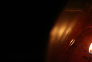
43. Here's a more extreme variant.
I think I see the same things you do, so I played with it a bit to try to push it a bit further. Using PWP I first made a mask to separate the statue from the background. Then I used some "Blur" (mainly Gaussian) tools to fuzz up the background even further, and used the Composite/Blend to combine the blurred/original versions into a satisfactory mix.

Reversing the same mask, I then added a bit of tint (Filter/81A?) to the statue, giving it a more metallic coloring, and used "Advanced Sharpen" to give it more punch and contrast to the blurry background. My interpretation was that the background could be either a hazy reflection of the book's story, or a real-life environment which was being muted by the subject's involvement in the book.

So, I'm not sure if this gets at what you were getting at, or just goes off into an idiosyncratic tangent, but I had fun and got a bit more practice with PWP.


Printer Friendly | Permalink |  | Top
 
xiamiam Donating Member (1000+ posts) Send PM | Profile | Ignore Thu Nov-30-06 12:39 AM
Response to Reply #43
45. i like this as well as the original...different yet both very nice...dont understand
anything that you did...but i guess thats for a different time...good job anyway
Printer Friendly | Permalink |  | Top
 
ConsAreLiars Donating Member (1000+ posts) Send PM | Profile | Ignore Thu Nov-30-06 02:39 AM
Response to Reply #45
46. Just playing. And messing around.
And learning a bit. As for my comments about what I did, they refer to the tools available in Picture Windows Pro (see http://www.dl-c.com ) but there are editing tools in other programs that will accomplish similar results. By describing these steps I hope to help others see how they might do similar things, should they wish.
Printer Friendly | Permalink |  | Top
 
xiamiam Donating Member (1000+ posts) Send PM | Profile | Ignore Thu Nov-30-06 10:27 AM
Response to Reply #46
47. thanks for the link and explaining how you did that....appreciate...nt
Printer Friendly | Permalink |  | Top
 
DU AdBot (1000+ posts) Click to send private message to this author Click to view 
this author's profile Click to add 
this author to your buddy list Click to add 
this author to your Ignore list Thu May 02nd 2024, 06:54 PM
Response to Original message
Advertisements [?]
 Top

Home » Discuss » DU Groups » Arts & Entertainment » Photography Group Donate to DU

Powered by DCForum+ Version 1.1 Copyright 1997-2002 DCScripts.com
Software has been extensively modified by the DU administrators


Important Notices: By participating on this discussion board, visitors agree to abide by the rules outlined on our Rules page. Messages posted on the Democratic Underground Discussion Forums are the opinions of the individuals who post them, and do not necessarily represent the opinions of Democratic Underground, LLC.

Home  |  Discussion Forums  |  Journals |  Store  |  Donate

About DU  |  Contact Us  |  Privacy Policy

Got a message for Democratic Underground? Click here to send us a message.

© 2001 - 2011 Democratic Underground, LLC