Welcome to DU!
The truly grassroots left-of-center political community where regular people, not algorithms, drive the discussions and set the standards.
Join the community:
Create a free account
Support DU (and get rid of ads!):
Become a Star Member
Latest Breaking News
General Discussion
The DU Lounge
All Forums
Issue Forums
Culture Forums
Alliance Forums
Region Forums
Support Forums
Help & Search
General Discussion
Related: Editorials & Other Articles, Issue Forums, Alliance Forums, Region ForumsOkay, what do you want us to do next? :)
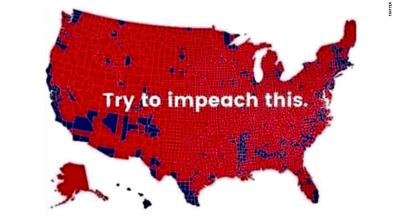
This is an idiotic Rethug meme I have seen several times.
:
InfoView thread info, including edit history
TrashPut this thread in your Trash Can (My DU » Trash Can)
BookmarkAdd this thread to your Bookmarks (My DU » Bookmarks)
9 replies, 874 views
ShareGet links to this post and/or share on social media
AlertAlert this post for a rule violation
PowersThere are no powers you can use on this post
EditCannot edit other people's posts
ReplyReply to this post
EditCannot edit other people's posts
Rec (4)
ReplyReply to this post
9 replies
 = new reply since forum marked as read
Highlight:
NoneDon't highlight anything
5 newestHighlight 5 most recent replies
= new reply since forum marked as read
Highlight:
NoneDon't highlight anything
5 newestHighlight 5 most recent replies
= new reply since forum marked as read
Highlight:
NoneDon't highlight anything
5 newestHighlight 5 most recent replies
Okay, what do you want us to do next? :) (Original Post)
edhopper
Dec 2019
OP

Laffy Kat
(16,373 posts)1. Where is this from? nt
edhopper
(33,482 posts)2. some stupid Repug gif
That has been making the rounds.

guillaumeb
(42,641 posts)3. Overlay this map with one showing population density.
With blue as the highest density, and the result will basically be the same.
Most GOP areas have very low populations.
edhopper
(33,482 posts)4. or in other words
Land doesn't vote, people do.

Skittles
(153,113 posts)5. from the idiots who think land votes

Patterson
(1,527 posts)6. The blue represents nearly 3,000,000 more votes.
edhopper
(33,482 posts)7. and over 40 more seats


csziggy
(34,131 posts)8. This is how to counter that map
A Great Example of Better Data Visualization: This Voting Map GIF
"Land doesn't vote. People do"
By Rain Noe - October 15
Done properly, the art of data visualization can be an incredibly powerful tool for educating people. It allows us to understand things that would otherwise be ungraspable due to their sheer complexity.
Done improperly, data visualization can be incredibly misleading. It's important that we have talented and hopefully unbiased (I know, what are the odds) designers presenting the information.
As one example of how bad data visualization can mislead, take a look at this map below. What you're seeing is a map of how each county in the United States voted in the 2016 Presidential election (Red = Republican, Blue = Democrat).
<SNIP>
{They put up the map in the OP}
It looks like a landslide--because visually, it is. However, this is a wildly inaccurate representation of proportionality vis-à-vis the population, because all of those little shapes representing counties have vastly different amounts of people living within them. As some might put it, "Land doesn't vote. People do."
Data scientist Karim Douïeb figured that a more accurate way to represent how people voted is to use colored dots, varied in size proportionally to the population of each county. He turned the results into this GIF, which provides a clearer picture:

More: https://www.core77.com/posts/90771/A-Great-Example-of-Better-Data-Visualization-This-Voting-Map-GIF
"Land doesn't vote. People do"
By Rain Noe - October 15
Done properly, the art of data visualization can be an incredibly powerful tool for educating people. It allows us to understand things that would otherwise be ungraspable due to their sheer complexity.
Done improperly, data visualization can be incredibly misleading. It's important that we have talented and hopefully unbiased (I know, what are the odds) designers presenting the information.
As one example of how bad data visualization can mislead, take a look at this map below. What you're seeing is a map of how each county in the United States voted in the 2016 Presidential election (Red = Republican, Blue = Democrat).
<SNIP>
{They put up the map in the OP}
It looks like a landslide--because visually, it is. However, this is a wildly inaccurate representation of proportionality vis-à-vis the population, because all of those little shapes representing counties have vastly different amounts of people living within them. As some might put it, "Land doesn't vote. People do."
Data scientist Karim Douïeb figured that a more accurate way to represent how people voted is to use colored dots, varied in size proportionally to the population of each county. He turned the results into this GIF, which provides a clearer picture:
More: https://www.core77.com/posts/90771/A-Great-Example-of-Better-Data-Visualization-This-Voting-Map-GIF
Hermit-The-Prog
(33,254 posts)9. thanks!
The jpeg from your link:
