Mapping Racist Tweets after the election
Mapping Racist Tweets in Response to President Obama's Re-election
During the day after the 2012 presidential election we took note of a spike in hate speech on Twitter referring to President Obama's re-election, as chronicled by Jezebel (thanks to Chris Van Dyke for bringing this our attention). It is a useful reminder that technology reflects the society in which it is based, both the good and the bad. Information space is not divorced from everyday life and racism extends into the geoweb and helps shapes its contours; and in turn, data from the geoweb can be used to reflect the geographies of racist practice back onto the places from which they emerged.
Using DOLLY we collected all the geocoded tweets from the last week (beginning November 1) with racist terms that also reference the election in order to understand how these everyday acts of explicit racism are spatially distributed. Given the nature of these search terms, we've buried the details at the bottom of this post in a footnote [1].
Given our interest in the geography of information we wanted to see how this type of hate speech overlaid on physical space. To do this we aggregated the 395 hate tweets to the state level and then normalized them by comparing them to the total number of geocoded tweets coming out of that state in the same time period [2]. We used a location quotient inspired measure (LQ) that indicates each state's share of election hate speech tweet relative to its total number of tweets.[3] A score of 1.0 indicates that a state has relatively the same number of hate speech tweets as its total number of tweets. Scores above 1.0 indicate that hate speech is more prevalent than all tweets, suggesting that the state's "twitterspace" contains more racists post-election tweets than the norm.
So, are these tweets relatively evenly distributed? Or do some states have higher specializations in racist tweets? The answer is shown in the map below (also available here in an interactive version) in which the location of individual tweets (indicated by red dots)[4] are overlaid on color coded states. Yellow shading indicates states that have a relatively lower amount of post-election hate tweets (compared to their overall tweeting patterns) and all states shaded in green have a higher amount. The darker the green color the higher the location quotient measure for hate tweets.
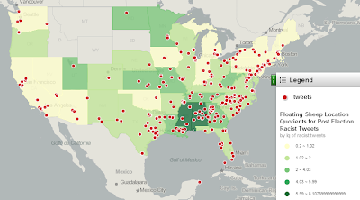
The map is larger and more interactive at the link.
http://www.floatingsheep.org/2012/11/mapping-racist-tweets-in-response-to.html