TOON: The Real Columbus
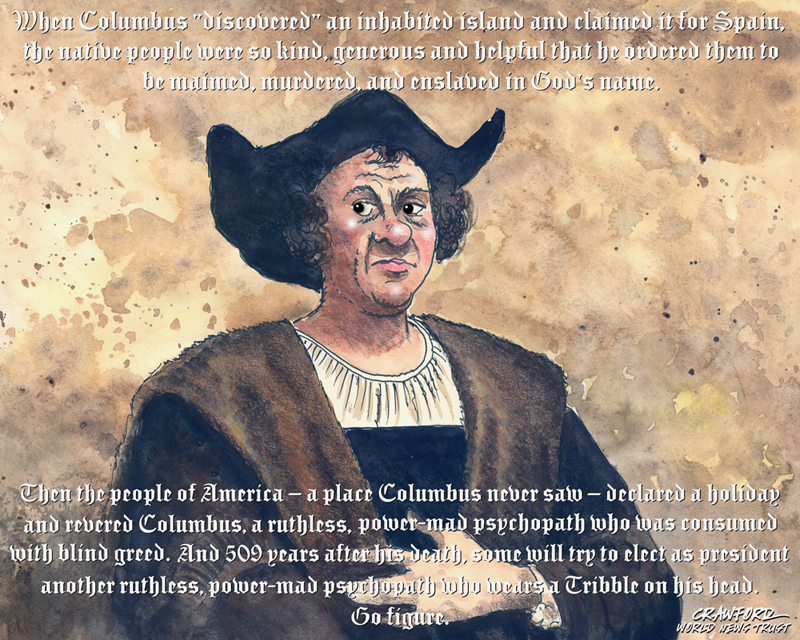
"The Real Columbus." Editorial cartoon by Gregory Crawford. © 2015 World News Trust.
Licensed under a Creative Commons Attribution-NoDerivatives 4.0 International License.
Based on a work at http://worldnewstrust.com/toon-the-real-columbus-gregory-crawford
Gregory Crawford's Weekly Rant!: http://worldnewstrust.com/Francis-Goodwin/Gregory-Crawford-s-Weekly-Rant-Self-Destructing-GOP
Crawford's WNT profile page: http://worldnewstrust.com/Gregory-Crawford/
Crawford's WNT blog page: http://worldnewstrust.com/all-items/?layout=author&authorid=380
Crawford's website: http://crawford.airlight.us/
 = new reply since forum marked as read
Highlight:
NoneDon't highlight anything
5 newestHighlight 5 most recent replies
= new reply since forum marked as read
Highlight:
NoneDon't highlight anything
5 newestHighlight 5 most recent replies

n2doc
(47,953 posts)
NonMetro
(631 posts)
gregcrawford
(2,382 posts)... I have no bias one way or the other on the wearing of Tribbles.
NonMetro
(631 posts)But the toon is biased, mean, and intentionally Ill willed, fully intended to insult people of Italian heritage, Christians, and actually of anyone of European heritage. Suppose we put up some toons intentionally insulting Native Americans? Would everyone say "Wow! - loved it"?
gregcrawford
(2,382 posts)... much of which is drawn from his own journals. And I am curious by what wonderful magic you are able to divine my intentions. I want me some o' THAT stuff! And even though there is nothing directed at anyone of the Christian persuasion or of Italian descent, apart from ol' Chris himself, I will point out that I, too, am of European descent.
And I'll bet you would look great wearing a Tribble.
NonMetro
(631 posts)But, point taken. I read too much into it. 
gregcrawford
(2,382 posts)
66 dmhlt
(1,941 posts)What happened to "No harm, no foul"? (After all, this isn't street ball.)
gregcrawford
(2,382 posts)... and "harm" implies at least the possibility of blood. After all, it's just an old saying that's been around for centuries and hardly worthy of note.

Gothmog
(145,107 posts)
Binkie The Clown
(7,911 posts)that such a busy font over the top of such a busy background makes it very difficult to read for people with less than perfect eyes.
gregcrawford
(2,382 posts)... being "of a certain age," with deteriorating eyesight myself. I thought the drop shadow helped to pop the copy from the background, but because I had composed, read, and edited it many times, it likely appeared clearer to me than it would to others. I was looking to sorta suggest the calligraphy above Columbus' countenance in that most common painting of him that I used for reference. It IS a very wordy caption, even for me, and I pared it down as much as possible, but the relatively small point size doesn't help matters. TMI?
So... sorry 'bout that! 
Binkie The Clown
(7,911 posts)is to put the caption, in solid black, on a separate layer with a white background box just big enough to contain the lettering. Then adjust the layer transparency to fade the white out a bit. The white on a transparency layer grays out the area right around the lettering, so the lettering seems to float on a slightly brighter, less contrasty area. Or put the white on a second layer and the lettering on a top layer and use "multiply" as the blend mode to keep the lettering sharp black against the faded patch on the background image. At any rate, an outline font increases the busyness. Solid black would be better IMHO.
Just an idea.
gregcrawford
(2,382 posts)... behind the black quite often. I've been a graphics professional for a little over fifty years, and know purt' near every trick in the book. But even an old silverback like me makes a judgement call now and then that I'll later question.
Binkie The Clown
(7,911 posts)an amateur like me telling an expert how to do it. A thousand abject apologies. 
gregcrawford
(2,382 posts)... and your suggestions generously offered. No apology necessary. 

MasonDreams
(756 posts)I still remember being very angry in "history"," starting"
in 1492? really? nothing about who was already here, and
Why do I remember columbus, cortez, pizzaro, de soto,
de sickos of mass murder and horrific torture? We were
"taught" this crap in 4,5,6th grades. All for the YELLOW
metal. The natives did wise up though "yes, yes its not
here, its just up that way, 2-3 days, its called ELDORADO
a whole city just full of GOLD!! keep going, up that way.