Democratic Primaries
In reply to the discussion: Red, white and blah: Why are these all these 2020 campaign logos so boring? [View all]Celerity
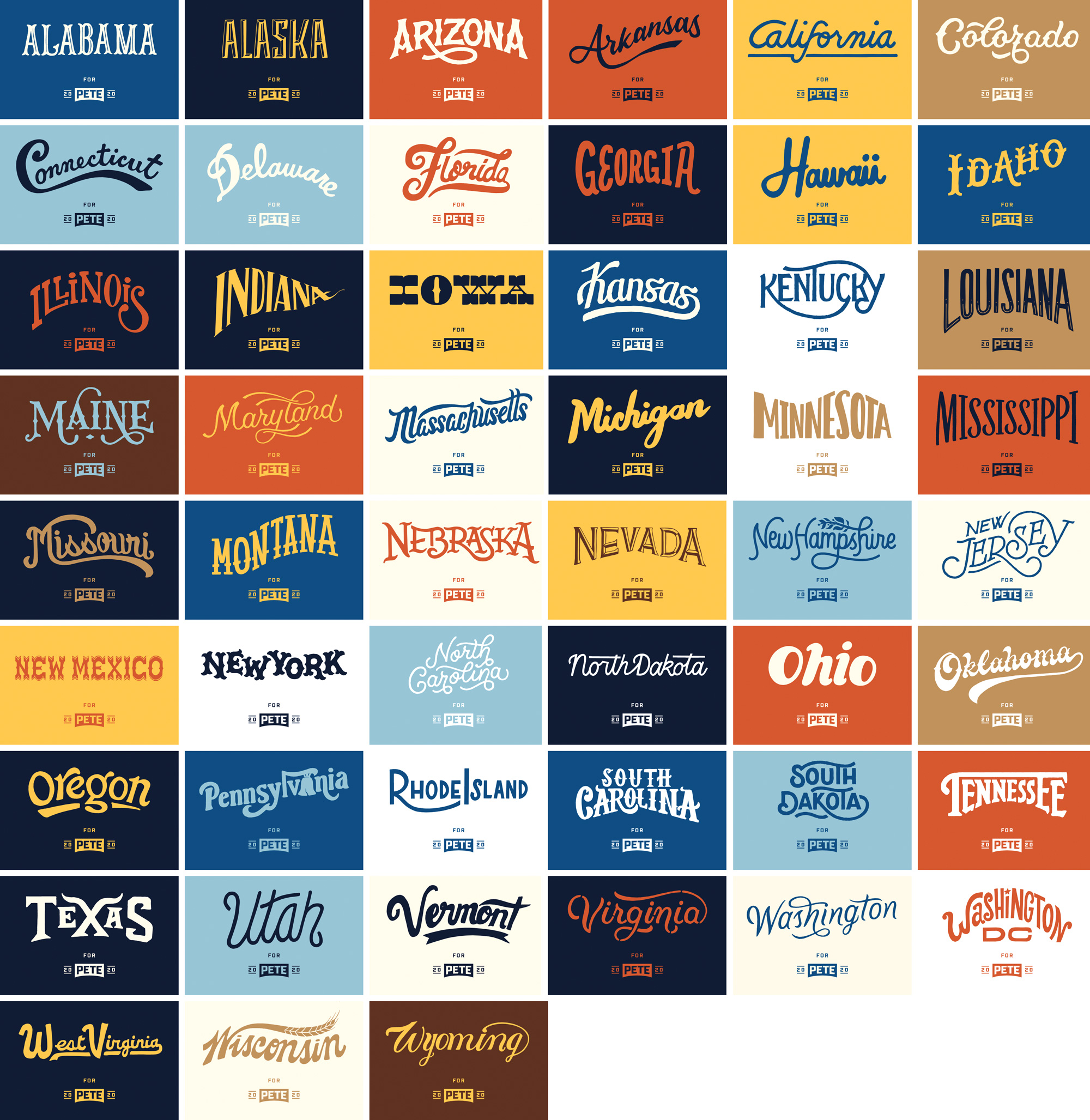
(43,333 posts)The official design toolkit site with far more detail:
https://design.peteforamerica.com/
a review by a branding design site
Water Under the Bridge
New Logo and Identity for Pete Buttigieg by Hyperakt Reviewed
https://www.underconsideration.com/brandnew/archives/new_logo_and_identity_for_pete_buttigieg_by_hyperakt.php
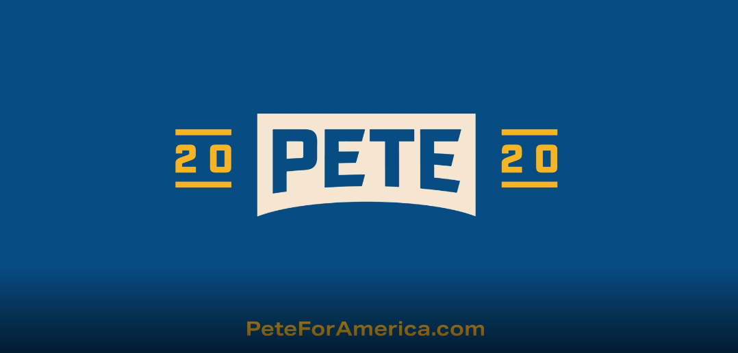
Pete Buttigieg is the mayor of the city of South Bend, Indiana, and the latest Democrat to announce his candidacy for the 2020 U.S. Presidential election. A graduate of Harvard University and Oxford University, he is a young 37-year-old, but has had experience working in the corporate world at McKinsey and Company, served as an intelligence officer in the United States Navy Reserve for 12 years, and is currently in his second term since 2012 as mayor of South Bend, helping the city evolve from various years of struggles. Buttigieg, married since 2017, is also the first openly gay Democratic candidate and municipal executive in Indiana — for non U.S. folks, this is like being a gummy bear in a tray of mashed potatoes. Yesterday, Buttigieg formally announced his nomination and introduced his campaign logo and identity designed by Brooklyn, NY-based Hyperakt.
https://www.underconsideration.com/brandnew/archives/pete_buttigieg_logo_meaning.mp4


Even though plenty has been written about the candidate logos so far, I have not written anything about them nor reviewed any of them, mostly because they have all been lackluster attempts at being the next Obama-logo-meets-Alexandria-Ocasio-Cortez-color-palette campaign identity of the year. Kamala Harris gets close to something but ultimately I keep seeing the Unbreakable Kimmy Schmidt titles and Beto O’Rourke’s logo is industrial-looking but perhaps to a fault. Don’t get me wrong, it’s amazing to see these candidates break the mold and put design front and center as part of their campaign but nothing so far has felt genuine or like an evident home run when it comes to campaign identities. Until now.
Buttigieg’s — well, Pete’s — logo is a strong, perfectly executed logo rooted in something meaningful and relevant to the candidate. The bridge may not be fully evident to everyone but it’s a very easy narrative to embed into the logo and once you see it, it makes the logo stronger. I like how the bridge bridges “20” and “20” — there is something nicely metaphorical about it for bringing two sides together. I normally cringe at gratuitous angle cuts in letters but the custom “E”s gain a lot of personality from the modification. The overall look of the logo is like something you would find rusted on an old piece of industrial equipment in someone’s barn in the Midwest. Yet slick enough to be printed on t-shirts and buttons and displayed on social media.


primary today, I would vote for: Joe Biden
Edit history
 = new reply since forum marked as read
Highlight:
NoneDon't highlight anything
5 newestHighlight 5 most recent replies
RecommendedHighlight replies with 5 or more recommendations
= new reply since forum marked as read
Highlight:
NoneDon't highlight anything
5 newestHighlight 5 most recent replies
RecommendedHighlight replies with 5 or more recommendations