| Latest | Greatest | Lobby | Journals | Search | Options | Help | Login |
|
|
|
This topic is archived. |
| Home » Discuss » Archives » General Discussion: Presidential (Through Nov 2009) |
|
| Kurt_and_Hunter
|
Thu Mar-26-09 02:33 PM Original message |
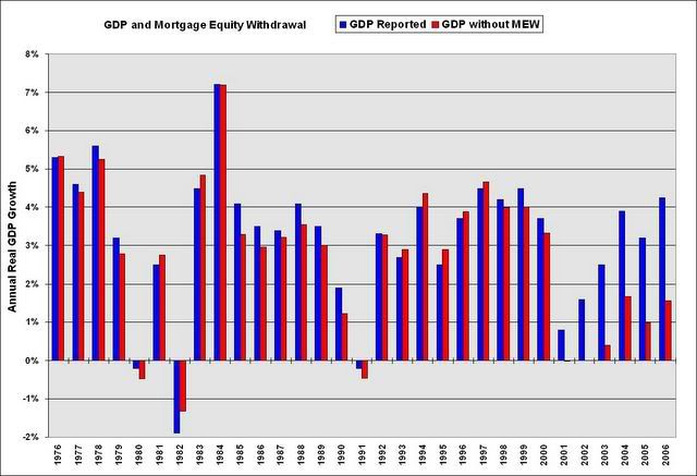
| Chart you want to see (the entire Bush economy was a sham) |
| Printer Friendly | Permalink | | Top |
| leftofthedial
|
Thu Mar-26-09 02:40 PM Response to Original message |
| 1. I get no chart, only the little red dot in a box. :-( |
| Printer Friendly | Permalink | | Top |
| Kurt_and_Hunter
|
Thu Mar-26-09 02:42 PM Response to Original message |
| 2. Link Fixed |
| Printer Friendly | Permalink | | Top |
| Kurt_and_Hunter
|
Thu Mar-26-09 03:56 PM Response to Reply #2 |
| 3. ... |
| Printer Friendly | Permalink | | Top |
| DrToast
|
Thu Mar-26-09 04:01 PM Response to Original message |
| 4. The chart is misleading |
| Printer Friendly | Permalink | | Top |
| Kurt_and_Hunter
|
Thu Mar-26-09 04:19 PM Response to Reply #4 |
| 5. I agree with you, but not intentionally so (Blame Greenspan... it's his metric) |
| Printer Friendly | Permalink | | Top |
| denem
|
Thu Mar-26-09 05:29 PM Response to Reply #5 |
| 6. I'm not sure if there is any relationship, but post 2000 |
| Printer Friendly | Permalink | | Top |
| DU
AdBot (1000+ posts) |
Tue Apr 23rd 2024, 07:58 PM Response to Original message |
| Advertisements [?] |
| Top |
| Home » Discuss » Archives » General Discussion: Presidential (Through Nov 2009) |
|
Powered by DCForum+ Version 1.1 Copyright 1997-2002 DCScripts.com
Software has been extensively modified by the DU administrators
Important Notices: By participating on this discussion board, visitors agree to abide by the rules outlined on our Rules page. Messages posted on the Democratic Underground Discussion Forums are the opinions of the individuals who post them, and do not necessarily represent the opinions of Democratic Underground, LLC.
Home | Discussion Forums | Journals | Store | Donate
About DU | Contact Us | Privacy Policy
Got a message for Democratic Underground? Click here to send us a message.
© 2001 - 2011 Democratic Underground, LLC