Democratic Underground Latest Greatest Lobby Journals Search Options Help Login
Google

Free parking.

Printer-friendly format Printer-friendly format
Printer-friendly format Email this thread to a friend
Printer-friendly format Bookmark this thread
This topic is archived.
Home » Discuss » DU Groups » Arts & Entertainment » Photography Group Donate to DU
 
Fovea Donating Member (1000+ posts) Send PM | Profile | Ignore 
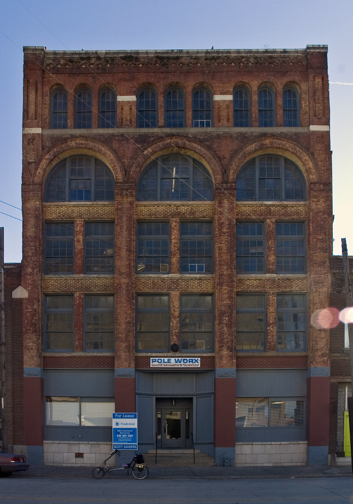
Wed Feb-01-06 07:09 PM
Original message
Free parking.
At the Pole Worx.

Printer Friendly | Permalink |  | Top
Boo_Radley Donating Member (280 posts) Send PM | Profile | Ignore Wed Feb-01-06 10:36 PM
Response to Original message
1. I like it
I like the composition and subject matter. There's something missing from it, though. I can't figure out what. I think it's that the color is a little flat in front of the building where there wasn't enough light.

I'm trying to learn to deal with color correction, myself. I'm taking a class in it, so maybe I'm just finding what's on my mind.

I like the shot itself, though. Good eye spotting that, and nice job framing up the picture.
Printer Friendly | Permalink |  | Top
 
Fovea Donating Member (1000+ posts) Send PM | Profile | Ignore 
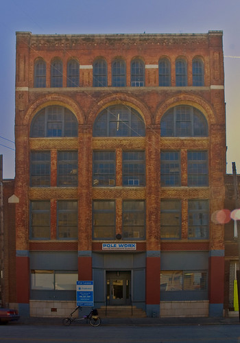
Wed Feb-01-06 11:07 PM
Response to Reply #1
2. I have another version of this shot
with insane saturation and a push up.

I think I like it better, but some might think it gimmicky.

http://www.flickr.com/photos/cameraobscura/94364731/
Printer Friendly | Permalink |  | Top
 
Boo_Radley Donating Member (280 posts) Send PM | Profile | Ignore Thu Feb-02-06 07:01 AM
Response to Reply #2
3. Both
I like the top part of the first one better, but the bottom part of the second one better. I'm probably just looking for trouble, because I'm in a class for this, so it's on my mind, in all honesty.
Printer Friendly | Permalink |  | Top
 
Fovea Donating Member (1000+ posts) Send PM | Profile | Ignore 
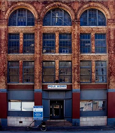
Thu Feb-02-06 12:59 PM
Response to Reply #3
4. Do you like the bottom of the first one for its
value, or saturation?

Or put another way, is this what you had in mind.

Printer Friendly | Permalink |  | Top
 
Boo_Radley Donating Member (280 posts) Send PM | Profile | Ignore Thu Feb-02-06 01:24 PM
Response to Reply #4
5. Exposure, mostly
Mostly for the increased exposure, and a little for the saturation.

I looked at that before I left for work, and since I had time to kill, and I need practice, I opened it in Photoshop and tried to edit it some. I ended up (I'm not very good at that, the reason I need practice) with a horrible gaudy looking thing, because I went too far with it, but what I did was to use the dodge tool to increase exposure a little, and used the sponge tool to add a little saturation. I ended up with something similar to the second one you posted, but not as good. It did satisfy my curiosity, though.

I think it's the exposure more than the saturation, though a little tiny bit more saturation in it wouldn't hurt. Not so much as to make it look like a colorful new building, because it's aged look is part of the appeal of the picture, but enough to try to match it up a little more with the top.

Note that I'm *very* new at this, at the touch up/darkroom emulation part of things, so don't take me too seriously on it. It's just what appealed to me.
Printer Friendly | Permalink |  | Top
 
lakemonster11 Donating Member (1000+ posts) Send PM | Profile | Ignore 
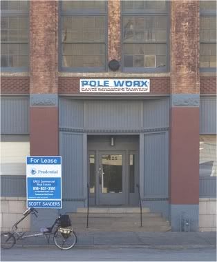
Thu Feb-02-06 05:22 PM
Response to Reply #5
8. How about this?
Printer Friendly | Permalink |  | Top
 
Boo_Radley Donating Member (280 posts) Send PM | Profile | Ignore Thu Feb-02-06 08:01 PM
Response to Reply #8
9. Whoa.
Jesus. You did a great job blending those changes in. Looks extremely natural.
Printer Friendly | Permalink |  | Top
 
hvn_nbr_2 Donating Member (1000+ posts) Send PM | Profile | Ignore Thu Feb-02-06 01:43 PM
Response to Original message
6. How did you get the perspective right?
It looks like you're standing at street level, but the building isn't leaning backwards.

View camera? Standing farther back than I think and using a long lens? Photoshop perspective correction?
Printer Friendly | Permalink |  | Top
 
Boo_Radley Donating Member (280 posts) Send PM | Profile | Ignore Thu Feb-02-06 03:45 PM
Response to Reply #6
7. Shift lense?
I'm just guessing. Either that or PhotoShop.

I'm thinking of investing in a shift lense, myself, because I do a lot of ground level shots of buildings when I vacation.

He did do a good job with that, whatever the method was.
Printer Friendly | Permalink |  | Top
 
Fovea Donating Member (1000+ posts) Send PM | Profile | Ignore Fri Feb-03-06 06:55 PM
Response to Reply #7
12. it is ps
crop, perspective adjust.
Printer Friendly | Permalink |  | Top
 
TahitiNut Donating Member (1000+ posts) Send PM | Profile | Ignore Fri Feb-03-06 10:42 AM
Response to Reply #6
10. That building is acutally wider at the top than bottom.
:evilgrin:

Sirius=ly, it looks to me like the photo is being taken from the roof of a 2-story building (or parking structure) across the street. That's the sense I get from the shadowing.
Printer Friendly | Permalink |  | Top
 
hvn_nbr_2 Donating Member (1000+ posts) Send PM | Profile | Ignore Fri Feb-03-06 01:59 PM
Response to Reply #10
11. I don't think so
but an interesting idea :-)
It does have an odd bulge outward, at the lower part of the fourth floor.

What about the shadowing makes you think it's a 2-story roof perspective? I'm not seeing anything and not understanding theoretically how the shadowing would change based on the viewer's location.

Here's what I see from this cropped view with brightness and contrast both increased:


The viewpoint is obviously above sidewalk level, since you can see the top of the sidewalk. It's also above the level of the landing at the top of the stairs in front of the entry door, since you can see the top of that too, although less clearly than the sidewalk.

Now look at the lines above the recessed doorway. The dark lines of the "flanges" directly at the side of the top of the door appear to go up from the horizontal dark line at the top of the door. That shows that the viewer's perspective is below the top of the door. If the viewer were above the top of the door, those "flanges" would appear to go downward as they go away from the door.
Printer Friendly | Permalink |  | Top
 
Fovea Donating Member (1000+ posts) Send PM | Profile | Ignore Fri Feb-03-06 06:56 PM
Response to Reply #11
13. It is a tripod shot
with the POV at about 5'.

I think the wide angle lens may be what you are seeing.
Printer Friendly | Permalink |  | Top
 
CC Donating Member (1000+ posts) Send PM | Profile | Ignore Sat Feb-04-06 12:40 AM
Response to Original message
14. I like this. You are very good at
Edited on Sat Feb-04-06 12:41 AM by CC
seeing great photos in everyday things. A lot of people would walk on by and never think to take a pic. I also like the other pics you have up.


Printer Friendly | Permalink |  | Top
 
DU AdBot (1000+ posts) Click to send private message to this author Click to view 
this author's profile Click to add 
this author to your buddy list Click to add 
this author to your Ignore list Thu Apr 25th 2024, 02:45 AM
Response to Original message
Advertisements [?]
 Top

Home » Discuss » DU Groups » Arts & Entertainment » Photography Group Donate to DU

Powered by DCForum+ Version 1.1 Copyright 1997-2002 DCScripts.com
Software has been extensively modified by the DU administrators


Important Notices: By participating on this discussion board, visitors agree to abide by the rules outlined on our Rules page. Messages posted on the Democratic Underground Discussion Forums are the opinions of the individuals who post them, and do not necessarily represent the opinions of Democratic Underground, LLC.

Home  |  Discussion Forums  |  Journals |  Store  |  Donate

About DU  |  Contact Us  |  Privacy Policy

Got a message for Democratic Underground? Click here to send us a message.

© 2001 - 2011 Democratic Underground, LLC