The DU Lounge
Related: Culture Forums, Support ForumsOlive Garden's new logo leaves investors with a bad taste in their mouth

To this:

The reaction was immediate and scathing. “It looks like a second grader’s cursive practice” griped Slate. That was polite compared to BusinessInsider.com’s brutal “People hate Olive Garden’s new logo." The closest thing to a compliment from any major publication was Time.com which skipped straight over the relative aesthetics of the simplified text and less ornate new look and took a shot at the entire chain by noting that “Olive Garden’s new logo probably can’t save Olive Garden."...
Running away from activists and throwing out an immediately despised logo may buy Darden some time, but unless customers start buying more meals Olive Garden and the rest of the corporation can run, but they won’t be able to hide for long.
 = new reply since forum marked as read
Highlight:
NoneDon't highlight anything
5 newestHighlight 5 most recent replies
= new reply since forum marked as read
Highlight:
NoneDon't highlight anything
5 newestHighlight 5 most recent replies

rocktivity
(44,576 posts)because the shrinking number of middle class families they depended on for business don't have the discretionary income anymore. What was wrong with their logo? I liked its "old world Italian" charm. 
Now let's spin that oldie but goodie: "FOUR blue screens of death? Let's hear it for truth in advertising!"
![]()

rocktivity[b/]
KamaAina
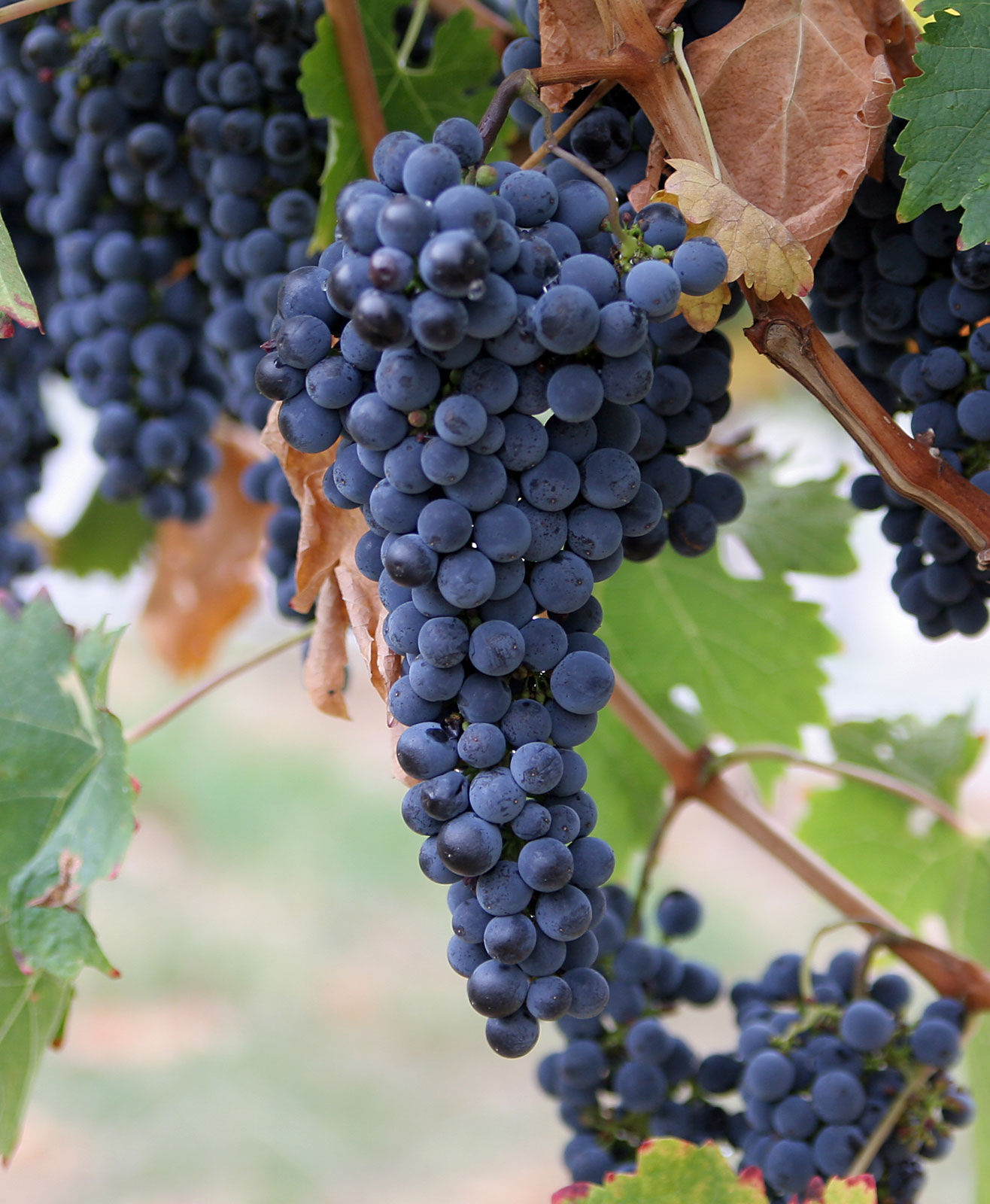
(78,249 posts)the olives kind of looked like grapes. 

Xyzse
(8,217 posts)
I always thought they were grapes.
I've only been to the Olive Garden twice in my life.
KamaAina
(78,249 posts) Xyzse
(8,217 posts)I just thought it was a design flourish, nothing else.
I never thought of them as olives.

NV Whino
(20,886 posts)Olives don't grow in clusters like that, nor do they have viney tendrils. The new logo is much more indicative of how olives grow. Hate the typeface, though. And I'm speaking as a graphic designer.
Xyzse
(8,217 posts)So, it is just a design flourish more than anything else.
Cool, I don't feel so crazy now.
I kinda agree on the typeface. I think I'd have kept the old type face without all that stuff on it.

Art_from_Ark
(27,247 posts)Their wine list features 38 selections, according to their web site.
Agschmid
(28,749 posts)
A HERETIC I AM
(24,367 posts)
Grapes;
"The Grape Garden"
NV Whino
(20,886 posts)Look at the growth pattern. Grapes.

David__77
(23,372 posts)It didn't land right, in my opinion. I'd prefer that Olive Garden strip away the pretense, and market itself as an Italian-themed "family restaurant" with good prices, period.

chrisa
(4,524 posts)
cyberswede
(26,117 posts)It's simple and clean. (sorry, wearing my graphic designer hat)
But, I don't see how a logo change will make any difference will increase customers.

rrneck
(17,671 posts)
kentauros
(29,414 posts)And they paid someone to not only come up with all the variations that happens when you generate a new logo, but then they chose what the designer probably didn't like nearly as much as their own top choice 

Exultant Democracy
(6,594 posts)It will make for a better App icon and faster website loading times. However agree this new trend in design also have a very retro feel.

pinboy3niner
(53,339 posts) KamaAina
(78,249 posts)It could be from the moms smoking while breastfeeding. 

Incitatus
(5,317 posts)
haele
(12,650 posts)That's a true-Type Script (probably public domain) similar to French Script MS with some of the "modified" in Paint. Just type out the text in French Script MS in a brown text box, copy it into paint, then trace over it a stylus, and tweek the picture so that you get that even line and a few embellishments (put a break between the i and the v and change the rotation of the "e" in Olive, and make that fanciful transition break between the r and the d and again, change the rotation of the e in Garden).
It would take me about five minutes to do a logo like that on my tablet with a good stylus and paint program.
Then it would just be a matter of superimposing "the olive branches", and there ya go.
Not a bad logo, but very easy and suspiciously cut-n-pasteable.
Haele

Enrique
(27,461 posts) bigwillq
(72,790 posts)But I bet the food is still awful. 

flying rabbit
(4,632 posts)at least invites the possibility that you might enjoy some rustic old-country Italian food. The new one does away with such pretense, and as a result, is much more honest.
Packerowner740
(676 posts)
madamesilverspurs
(15,801 posts)Wonder if it was designed by whoever it was who created the Democrats' new non-logo...
Art_from_Ark
(27,247 posts)They all seem to be following the same pattern-- If it ain't broke, break it!
davidpdx
(22,000 posts)By the end of the year we'll have the top 10 most idiotic corporate logo changes.
Microsoft
Yahoo
Olive Garden
...............................................................
David__77
(23,372 posts)As was pointed out above, it's 70s-ish. I prefer that aesthetic to the circa 2000 one it replaced. Brown and other earth tones are good food marketing colors, in my opinion. I also like the simple font.
KamaAina
(78,249 posts)You just like the unlimited breadsticks and breastfeeding women. 
That's hilarious, and I'll never think of "family restaurant" the same!
PassingFair
(22,434 posts)Who cares?
