The DU Lounge
Related: Culture Forums, Support ForumsRequesting your feedback on a client-provided food porn shot (it's not one of mine)
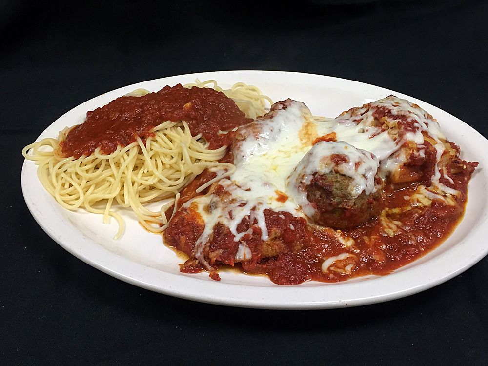
You may have seen two "food porn" posts I did recently from my new client, one of entrees and the other of desserts. In most cases, the food was plated very well and I got what I felt were some pretty decent shots.
My client sent me the photo above a few days ago. I have a few issues I'll list, but I'm more interested in hearing what you folks have to say.
1). This is a "sampler" plate from their menu which features lasagna, chicken parm, one meatball, and one sausage. Problem is that with the sauce and cheese covering, the only thing I can clearly identify on the plate is the meatball.
2). There is spaghetti on the plate, which is not in the menu description for this item, so I don't know if there's spaghetti AND lasagna or if they substituted spaghetti FOR lasagna.
3). Technical issues (like I said, it's not my photo)...I always center the plates, because I hate clipped edges like this. lack of symmetry, for me, is a badly composed shot. Strand of spaghetti on the rim of the plate, not good. I would put the lasagna, chicken parm, meatball and sausage on the plate with NO sauce, add enough sauce to each so that at least half of the item was still visible, and then top it with enough cheese to make it look plentiful but still allowing people to see what was under the cheese and sauce. One little dot of something in the sauce on top of the spaghetti...probably a sliver of garlic...but if I had been there taking the photo, I would have plucked it off for symmetry's sake.
Your thoughts?

 = new reply since forum marked as read
Highlight:
NoneDon't highlight anything
5 newestHighlight 5 most recent replies
= new reply since forum marked as read
Highlight:
NoneDon't highlight anything
5 newestHighlight 5 most recent replies

winter is coming
(11,785 posts)Also, would it be possible to filter the photo to make the sauce a little bit redder? I don't want it to be red red, like fresh tomatoes, but it's just the slightest bit too brown for me. When I see it, I think of sauce that's been simmering for a week, not hours, and that's not appealing.

femmocrat
(28,394 posts)And I agree with everything you said. The food is arranged too symmetrically and the sauce looks yucky.

auntAgonist
(17,252 posts)Can hardly see the meatballs for the cheese. I think that's a piece of lasagna in the upper right and some/too much spaghetti on the left.
I would remove the spaghetti, centre the lasagna and do nothing to it, serve it just as it came out of the baking dish.
The meatballs could be smaller but not necessary and they need a lot less sauce and cheese.
The whole plate looks like it's drowning in cheese and sauce.
It needs a sprig of green on top of meat somewhere .... (?)
I'd choose a different shaped plate too. Something oval-elongated so the food wouldn't be lost in it.
It just doesn't look very appealing or appetizing the way it sits.
I guess just clean up the plate and dress it a bit.
aA

TuxedoKat
(3,818 posts)You just see red and white all meshed together unless you look at it closely and at the first glance it doesn't look that appetizing so I think most people wouldn't give it a second glance to try and decipher what's on the plate. Should have the main entrée more clearly visible and the supporting items around it more clearly defined too. Some green vegetables to balance out the plate would nice too to break up all that red and white.

Tab
(11,093 posts)I used to do a lot of photography - not food styling, but I'm not unfamiliar with it. I can't compare the ingredients on the plate to the menu because I don't have access to a menu, however...
It looks unappetizing as crap.
A little bit of basil sprinkled on the top would go well. Some steam (which you can add after the photo) would have made it look hot and fresh. And photographing it on a tablecloth (even a blue and white checkered on, or hell, even a while tablecloth) would have made a hell of a difference.
Finally, like you noticed, I would have cleaned up the portions so they looked like they were arranged and not just ladled haphazadously on the plate.
Depends on the audience though. If this is a cheap diner, and what people expect, fine, but anywhere else I'd have it redone.

NV Whino
(20,886 posts)But this is a disaster.
First, the black background with the harsh lighting is a killer. Center the dish. This is the star of the show. Make so.
Then, you can't tell what most of the food is. Spaghetti is dry and unappetizing. Food needs to be separated with a drizzle of sauce and some cheese as you mentioned. Maybe even a side dish of cheese to indicate you can pile it on if you want.
Restaurateurs (AKA cooks) seldom understand that food for photos doesn't need to taste good, it just needs to look good. Therefore, oil up that spaghetti.

The Velveteen Ocelot
(115,894 posts)or a high school cafeteria. Spaghetti is hanging off the side of the plate; there's something under the sauce (of which there is too much) besides meatballs and you can't tell what it is; and the cheese (of which there is also too much) just looks gummy. The angle is weird and the lighting is too bright. It does not want to make me eat it. Since it's not at all exciting it doesn't really qualify as food porn.

lunatica
(53,410 posts)1. Background colors and eating accouterments such as a frosty glass of water or a glass of wine, a bit of a side dish showing a crisp salad with some sort of cheese sprinkled on it, and definitely a basket of garlic bread, but nothing that overshadows the main dish. All of them just barely in the photograph, but make it look like a table is set and the customer is sitting in front of it.
2. Color added to the main dish that's pretty colorless or all monochromatic helps. A sprig of something green, or a green bay leaf or finely chopped Italian spices sprinkled on on the food and a little just on the plate.
3. The food actually looks both too dry and too wet and cold. The cheese on top of the meat balls should be more brown baked, perhaps using a blow torch sparingly in the right places. There should be some dry freshly grated cheese on top of it because the cheese now looks all melted and formless. There's too much sauce on the meatballs and whatever else is there which isn't recognizable. I can picture the customer scraping the sauce aside to see what's under it.
4. the pasta looks too dry. It should have visual appeal and look like it's freshly made and pliable. Perhaps mixed up with olive oil to give it a wet look as if it has just been served hot and wet. Or spritzed with olive oil.
Everything above should be done sparingly just to add visual appeal.

Generic Brad
(14,276 posts)Tasty leftovers, though.
Seriously, it appears as though they cleaned out the fridge and poured sauce over everything.
Tab
(11,093 posts)This is the extent of my photoshop brain on a Sunday morning.

Same shit, different picture 


Tab
(11,093 posts)but it's at least prettier on some level

TreasonousBastard
(43,049 posts)The first thing I think of is vomit, and then I notice the plate partly out of the picture, and then I notice the plate is suspended on a black background...
It takes "unappetizing" to new levels.
If I were threatened with the loss of my firstborn to do this shot, I might consider arranging the samples around a smaller, and more neatly arranged, pile of pasta in the middle of the plate. Sparkly redder sauce, and less of it, and less cheese-- all of it far more artfully arranged. And cleaner. The long plate idea is a good one, but perhaps this was meant to be what is actually served.
And yes, whoever suggested an actual table and setting was right on. A big point of food pictures is to make it look inviting and delicious the way you would normally see and eat it.
I am flashing on the Little Caesar's commercials, where the pizza looks like crap in the commercials, so how bad is the real stuff...
trof
(54,256 posts)And that was before I read your post.
Now...
1. I would NEVER order that kind of 'sampler' plate.
2. If I had a restaurant, I wouldn't offer it either.
Just my 2 cents.

Kali
(55,026 posts)my first thought was looks pretty good, maybe some MORE cheese
as a plate of food set in front of me, if it was hot and smelled good, that wouldn't be too bad as is, though a sprig of parsley or basil would fix a lot of the presentation.
as a web or menu photo? uh, no not too appetizing, needs everything suggested above - leave out most of the sauce and cheese so you can see what the individual items are, add some greenery, and fix the spaghetti (my guess it goes with the chicken parm and is not a sub for lasagna) and add the table/beverage/vase of flowers or whatever in the background

Paulie
(8,462 posts)If it's not then the message is just plain wrong. Plus I prefer shaved parmisan cheese over slopped on mozzarella.
trueblue2007
(17,242 posts)i would not order this food.

petronius
(26,606 posts)I can't see that there's chicken parm (front center?) or a sausage (back center?) on the plate, the framing is bad, and the spaghetti dangle is a bit distracting. More sauce on the spaghetti and less on the other items (and in the right/front) would help. It also looks a little over-lit on the cheese and the sauce on the right...
Laffy Kat
(16,388 posts)
elleng
(131,188 posts)

jmowreader
(50,566 posts)1. Red and white checkered tablecloth as a background.
2. Glass of wine, bud vase with a rose in it. REALLY nice silverware to the sides. And use a plate that doesn't look like it was stolen from a mess hall somewhere.
3. Spaghetti in the middle of the plate. Meat dishes to either side.
4. Put the sauce on with a teaspoon, not a ladle. Just use enough so the customer can see the sauce, but also the food under it.
5. A couple pieces of garlic bread or bruschetta for decoration. Maybe some parsley?
6. Apply cheese just before photographing

Major Nikon
(36,827 posts)The image looks as if it was probably lit from an overhead artificial light source, possibly fluorescent, and possibly some fill from an on-camera flash. I suspect all of the fill flash and color balance was done automatically by the camera, which did a decent job of dealing with what it had to work with. The differences in artificial light temperature, throwing off the color correction, combined with less that optimum light angles, makes the food appear unnatural and unappetizing.
sarge43
(28,946 posts)It needs some color contrast, parsley perhaps or a table cloth or glass of wine. I agree there's too much on the plate.
Ike Y
(22 posts)The shape looks awfully suspicious!

mackerel
(4,412 posts)and either chopped basil or parsley on top. Always serve beef with red sauce with a green veggie. (Worked in food industry and catered for years.)
Note: You could go zucchini but you have to be sure it's not over cooked.