Photography
Related: About this forum

 = new reply since forum marked as read
Highlight:
NoneDon't highlight anything
5 newestHighlight 5 most recent replies
= new reply since forum marked as read
Highlight:
NoneDon't highlight anything
5 newestHighlight 5 most recent replies

Mira
(22,380 posts)maybe it reminds me of one of my personal favorites in my files. It's lots more interesting in the b/w. Though I like the vantage point of the second one a lot. I'd like to see that on in b/w.
Very nice post. Thanks.

alfredo
(60,074 posts)them and see what happens.

Solly Mack
(90,767 posts)Love the B&W.
alfredo
(60,074 posts)
CaliforniaPeggy
(149,622 posts)I love the color shots more. The B&W is nice too, but there's just something about color. I do like the subtle textures in the B&W, though. They do show up better there...
Anyway, nice job!

alfredo
(60,074 posts)
NV Whino
(20,886 posts)Love the composition, and the b&w is just right.
alfredo
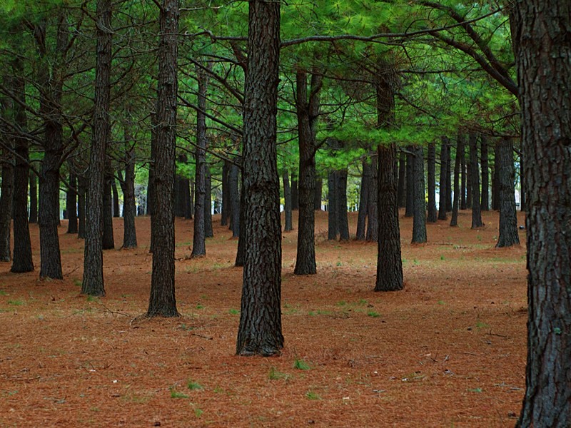
(60,074 posts)detail in the ground.

dmoyer
(114 posts)
glinda
(14,807 posts)alfredo
(60,074 posts)
lastlib
(23,236 posts)...of Styx's "Grand Illusion" album cover.
alfredo
(60,074 posts)lastlib
(23,236 posts)alfredo
(60,074 posts)
tawadi
(2,110 posts)Thanks for sharing.

1620rock
(2,218 posts)alfredo
(60,074 posts)
ManiacJoe
(10,136 posts)Love the colors in the last. I was playing with some of the options for b/w conversions; lots of good options in this set!
alfredo
(60,074 posts)alfredo
(60,074 posts)I'd like to see what you have done with the conversions.
ManiacJoe
(10,136 posts)I started with your third shot for the vibrant colors.
This first one was all photoshop, playing with the sliders in the b/w dialog.

The second is using the plug-in "Silver Efex Pro"
