Photography
Related: About this forumOpinions Please!
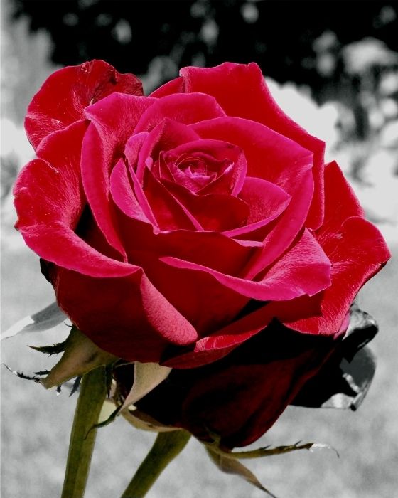
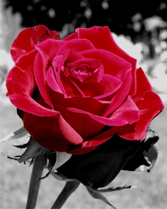
I was asked to produce a B&W/Color mixed photo of a special rose. I came up with two variants: The first with the roses and foliage in color and the second just the single bloom in color. I'm leaning toward the single bloom, but would like to get some input on which has more impact as I like the additional green in the photo also. The print is going to go in an 8x10 frame. Thanks in advance for your comments and suggestions!
 = new reply since forum marked as read
Highlight:
NoneDon't highlight anything
5 newestHighlight 5 most recent replies
= new reply since forum marked as read
Highlight:
NoneDon't highlight anything
5 newestHighlight 5 most recent replies

Behind the Aegis
(53,956 posts)But, I do like the top one a smidge better.
bluesbassman
(19,372 posts)
Blue_In_AK
(46,436 posts)but I need to qualify that by saying that I am a color person. I prefer the little bit of green, and if I were going to do this picture, I would color that leaf on the lower right to keep it consistent with the stems.
But, as I said, I like color
bluesbassman
(19,372 posts)There is a second bloom and I purposely left that part B&W as it was badly discolored and looked better in B&W. Thanks for the input Blue! 
Blue_In_AK
(46,436 posts)It just kind of looked like a leaf to me. I can understand why you wouldn't want to draw attention to a flaw. It's a very pretty shot, by the way.

Solly Mack
(90,765 posts)I like the hint of red in the BW bloom.
Blue_In_AK
(46,436 posts)The second one seems a bit too stark.

In_The_Wind
(72,300 posts)It's a very pretty rose.
Hoppy
(3,595 posts)But they are both excellent.

Mira
(22,380 posts)To me the green does not add anything to the photograph. The absence of it makes the bloom look supported, cradled and allows the red to pop even more.

alfredo
(60,071 posts)The best face lift is the one that is opaque to the viewer.
It is easy to see the background as colorless, but not the stem and second rose.
The real test is the client. Will he/she notice that the second rose in the first image is red with some monochrome petals? Can you clone it out, or adjust color selection (threshold) to include that petal in the selection?

ManiacJoe
(10,136 posts)As a secondary concern, the obvious selective color processing fad just looks cheesy to me. In the first shot the color seems to slowly fade away, much nicer.
alfredo
(60,071 posts)ManiacJoe
(10,136 posts)alfredo
(60,071 posts)
Mz Pip
(27,442 posts)The first one has some definition under the bloom. The bud in the second one appears flat, like an empty space.

Curmudgeoness
(18,219 posts)But there are very few things that I appreciate more in b&w. I do like the b&w background with the first one though, since it does accent the color of the rose.