Photography
Related: About this forumdo you mind if i opine?
i dont usually post my own pics here, tho i love seeing everyone elses.
i have wrestled w what makes a photo art. i tend to favor things like cindy sherman's set ups, rather than randomly captured subjects.
a great subject makes a nice photo, but i dont see the art there.
but i figured out what it is- composition.
so many photos have their subject centered in the pic, and it's just, well, boring.
art pulls you in. makes you wonder what is behind that object, or around that bend in the path.
it is hard wired neurology that we look first at the lower left corner of an image, and then sweep around it.
it has long been standard advice to look at all 4 corners of your shot.
do that w an eye to were the movement is. to where your eye wants to go.
if it wants to go in on the left, and straight out on the right, change your angle.
make it move. make it suck you in.
that's the diff between a good shot and a great one.
does that make sense?
 = new reply since forum marked as read
Highlight:
NoneDon't highlight anything
5 newestHighlight 5 most recent replies
= new reply since forum marked as read
Highlight:
NoneDon't highlight anything
5 newestHighlight 5 most recent replies

Karadeniz
(22,557 posts)Maybe that's art. You can't change it without diminishing its impact.
mopinko
(70,178 posts)i agree, mostly. poetry is when every word is perfect.
but i bet poets are like artists- sometimes the temptation to take a painting out of the frame and make it better can be overwhelming.
i've done it.
i bet every published poet has that one poem w that one word that could have been better.

Pobeka
(4,999 posts)I don't remember where -- it's been a couple of years -- but I remember looking at photos of English Royalty done over several decades by the same photographer.
I enjoyed the photos quite a bit. It was intriguing to see the expressions, the clothing, all of it.
Only at the end did I notice -- in nearly every shot, the subject was dead center in the frame. And I, who had studied photo composition for a couple of years as a hobbiest, didn't even notice while I was viewing the photos.
So I would say a pleasing composition can be driven by the subject, and breaking guidelines is sometimes just fine.
In the end, you have to ask yourself -- is this pleasing/interesting? If so, you got the composition right. As you practice your composition skills, you'll constantly see ways to enhance the composition during the photo capture, and afterwords in post processing.
It is indeed art, and can be a lot of fun.
mopinko
(70,178 posts)because we are so hard wired to examine human faces and bodies, you can get away w that.
but the rules still apply in that, most of us arent royals, or photographing royals.
some photos are art. but to me, most are design.
now, i love good design. whether it's a movie or a candy wrapper. but only a few bits of design get to the level where most ppl would consider them art.

mnhtnbb
(31,399 posts)You can capture a moment in time--randomly--that tells a story. You can deliberately create a studio shot that tells a story.
A little over a year ago--and it feels like more than that--I took a tour with a professional photographer in Halifax, Nova Scotia. He shared a number of pointers with us, as he took us around to places where we could get some good shots, and one of them was about composition. Shared some of his work with us to illustrate points about placement of subject. Since then, I've been much more aware of framing and composition when taking shots. One of the other tricks he offered--which I didn't know--was when shooting a person in a landscape background to back up about 20 feet from the subject and zoom in order to really make the details of the background much larger. I've watched professional photographers using that trick when shooting portraits in the old City Market area across the street from my building which makes for lovely old brick and cobblestone background for the portraits.
Yes, art does pull you in.
so, there is a painter i'm obsessed w- ruth van sickle ford.
she was so acclaimed in her time but no one remembers her now.
i never met her but i was raised in the same house as she.
she should be remembered as the greatest of the ashcan school.
she traveled the world, painting her little hear out.
one of her fave spots was newport conneticut. known as motif 1, since so many painted that little seaside town. i bought one of her newport painting, and it is the only one i have seen of that particular dock and fish house.
but she painted so many 'quaint' places.
there are a lot of great spots in the world to shoot or paint.
the greats find the one no one else noticed.
ps- no one remembers her now because she was a bitch. just an epic bitch.
but that's what made her great. she took no prisoners. ever.
mopinko
(70,178 posts)i dont know about y'all, but i need a break from all the mess we are in.
we cant go out and see art, and it's hard to even get out and shoot much. but i could talk about art allllll day.

flamin lib
(14,559 posts)Yes there are rules of composition that help us define what makes a visually interesting picture but simply following rules can produce some very mediocre images. Conversely, breaking them at the right time and using that visual conflict can sometimes rivet a viewer.
Henri Cartier Bresson was a master at combining conventional and unconventional compositions with that single sliver of time a camera can give us. In one instance he composed a picture looking down on a circular stairway onto a sidewalk. He needed one more element to complete the composition so he waited patiently until a cyclist rode past. Rules say the cyclist should be entering the picture but Henri waited until the bike rider was almost out. It works.
If I were Bresson I'd have given the first kid on a bike I could find $5 to ride by repeated until I got the shot. But that's just me.
"To take a photograph is to align the head, the eye and the heart. It's a way of life"
- Henri Cartier-Bresson
mopinko
(70,178 posts)if you dont know the rules, you cant break them well.
when i went to art school, rules were out of fashion. didnt learn them.
i mostly wish they had. ie- i had no idea that mothers and children was an almost taboo subject. unless it's a madonna. just found that out today. my most common subject, cuz i always painted myself. crying madonnas esp not welcome.
i'm taking voice lessons now, and my teach and i have had this convo several times already.
flamin lib
(14,559 posts)
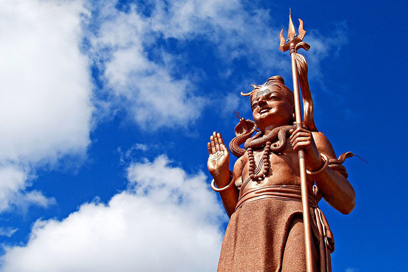
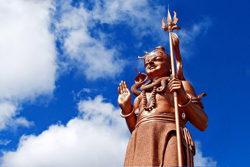
William Seger
(10,779 posts)One of the following is a photo I took from a web page discussing composition. In the other two, I've moved the statue somewhat. Which composition do you prefer?

mopinko
(70,178 posts)the farther you move her, the more that solid blue just hangs there, and weights it all down.
it would be a bit better if the trident or whatever it is she is holding wasnt so close to the top of the frame. makes the eye want to wander out of the pic.
William Seger
(10,779 posts)The first one is the original, and as you probably know, it follows the "Rule of Thirds." I didn't really like it; it looks off-balance to my eye.
For the third one shown (which I actually did before the second one), I just plopped the statue down as I might have framed it if I was taking the shot: off-center but to the right side of center (because the statue is turned to the left).
In the second one shown, I put the statue at the "golden ratio" point: The ratio of the right side to the left side is the same as the ratio of the left side to the full width. (That makes it about 1.6 times the right side.) Classical painters used that "rule" much more than thirds, and in this particular case, I think I like it best.
Anyway, an important thing to remember about composition is, if you shoot something with a wider view than you intend to use in the final image, you can crop it down to suit your compositional taste.
William Seger
(10,779 posts)I was mainly interested in the positioning of the statue, but you're right that the solid blue on one side and large cloud on the other side wasn't very appealing, so I've cloned just a bit of cloud on the right, which I think helps quite a bit. (Since I'm not a photojournalist, I'm not above "faking" a bit if it helps a shot.  ) You may need to reload the images individually to see them, if your browser cached them.
William Seger
(10,779 posts)mopinko
(70,178 posts)it's hard to think of a sky as anything but a null background. but that blue is soooo strong.
it still bugs me that whatever she is holding almost leaves the shot. it cuts off the right hand space. you just need bit more space to have room to come around and back in.
the golden ratio is a useful concept. but the golden spiral is what you really want. you want to suck the eye in, make it swirl around in the picture.

ManiacJoe
(10,136 posts)is a great way to improve your photos. This article seems pretty good at explaining:
https://petapixel.com/2016/09/14/20-composition-techniques-will-improve-photos/

Dyedinthewoolliberal
(15,584 posts)A photo composed correctly is 90% of the image. 