Environment & Energy
Related: About this forumIt's looking very bad these last few weeks at the Mauna Loa carbon dioxide observatory.
At the Mauna Loa carbon dioxide observatory website, they have a data page which compares the averages for each week of the year with the same week of the previous year.
The data goes back to 1974, and comprises 2,090 data points.
I import this data into a spreadsheet I maintain each week, and calculate the weekly increases over the previous year. I rank the data for the increases from worst to best, the worst data point being 4.67 ppm over the previous year, which was recorded during the week ending September 6, 1998, when much of the rain forest of Southeast Asia was burning when fires set to clear the forests for palm oil plantations got out of control during unusually dry weather. Six of the worst data points ever recorded occurred in 1998 during this event, another was recorded in the January following that event.
Of the twenty worst data points ever recorded out of 2090 two of them have occurred in the last four weeks. The week ending January 31, 2016 produced a result of a 4.35 ppm of increase. The week just passed, that ending, 2/14/2016, produced a result of 3.79 ppm increase, tying it for the aforementioned week in January 1999, that ending on January 24, 1999, and that of January 2, 2011.
Of the twenty highest points recorded, 9 have occurred in the last 5 years, 10 in the last 10 years.
The week ending February 7, 2016 was until today's data was published, the 20th of the top 20, it was pushed out and is now the 21st worst.
I also keep a record of the monthly data that is similar to that for the weekly data. This data, unlike the weekly data, goes back to 1958.
November of 2015 was the second worst November ever recorded, 3.08 ppm over the previous November, December of 2015, the worst ever recorded, 3.07 ppm over the previous December, and January of 2016 the 4th worst ever observed, 2.56 ppm over the previous January.
The observatory is still evaluating the final results for 2015; it involves a running average from November through February compared with the data of the previous year. A few weeks ago the preliminary data suggest that 2015 was the worst year ever observed, the data today declares that it is actually a few hundredths of a ppm (a few hundred millionths of a part) behind 1998.
There is no event of which I'm aware comparable to the 1998 fires, and that makes this doubly disturbing to me at least, since it suggests what may be an out of control event such as temperature driven out gassing of sequestered carbon dioxide from permafrost or from oceanic hydrates.
But there's no reason that you should be disturbed as I am. Don't worry, be happy: They're building a solar roadway in France, and even if it ends up covered with grease, skid marks, tire wear marks, sand and salt, it's the thought that counts.
My worry that we are kidding ourselves to the point of suicide by thinking we're actually doing something is pure "Chicken Little," I'm sure.
I now return you to the Hillary vs. Bernie cartoon show.
Enjoy what's left of the weekend.
 = new reply since forum marked as read
Highlight:
NoneDon't highlight anything
5 newestHighlight 5 most recent replies
= new reply since forum marked as read
Highlight:
NoneDon't highlight anything
5 newestHighlight 5 most recent replies

daleanime
(17,796 posts)
pscot
(21,024 posts)Thank you. No more highways. I want mylar sails, surfing the ionosphere.
Ghost Dog
(16,881 posts)your dsta on a graph and present it visually?
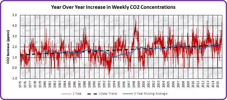
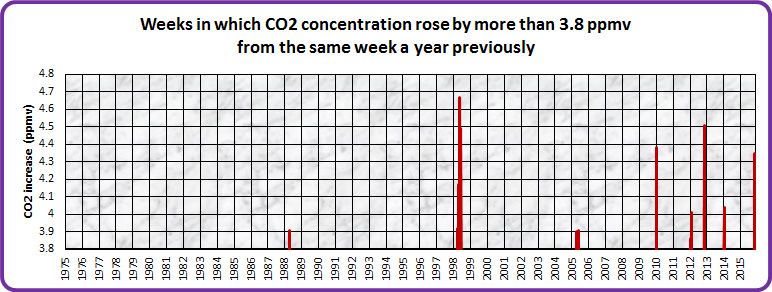
GliderGuider
(21,088 posts)I used the same Mauna Loa data set as NNadir: http://www.esrl.noaa.gov/gmd/ccgg/trends/data.html
The first graph is a straight plot of annual CO2 increases. Note that both the linear trend and five year moving average clearly show an increasing rate of accumulation.
The next one shows only weeks whose annual increase was over 3.8 ppmv. Keeping in mind that 1998 was an anomalous year, the increasing frequency of such excursions is clear.
Ghost Dog
(16,881 posts)as measured at that altitude at that location.
Increasing rate of increase ==> Exponential Growth.
